
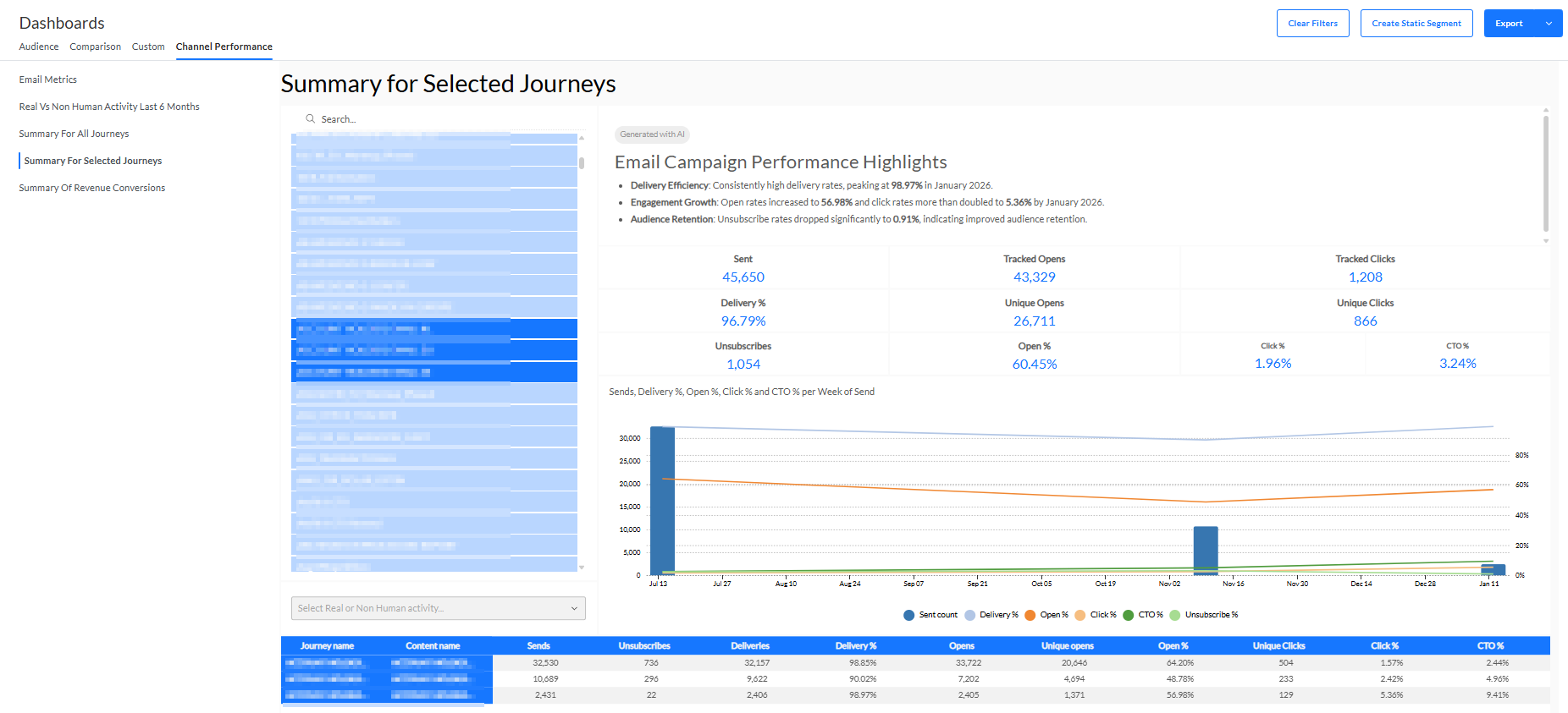
The Summary for Selected Journeys tab provides a dashboard with summary info of the journeys that are selected.
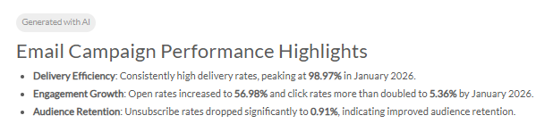
- An AI-generated summary of this dashboard is displayed at the top.
- Journey selector — Select journeys that you want to visualize.
- The list shows the most recently executed journeys based on sent date.
- You can select as many journeys as you want.
- You can also search for a specific journey name by entering text in the search field on top to reduce the list of journeys.
- By default, no journeys are selected and thus no reporting data is available on the screen.
- When you make a selection, all reporting widgets are dynamically updated.
- When multiple journeys are selected, widgets will show aggregated data for all selected journeys.
Note 1: Selected journeys remain selected after being filtered out of the list after a search.
Note 2: Journeys having the same name appear only once in the list, but selecting the name will select all journeys having that name.
Note 3: Renaming a journey from the Selligent by Zeta user interface does not rename it in the dashboards.
® Contact Zeta support when you need a change. - Select All, Real or Non-human activity — Drop-down via which you can select to filter on all activity (real & non-human combined), real activity (human), or non-human activity (bots).
- By default, reporting is shown on all activity.
- When a filter is set, you can click the x icon to reset the filter, and show all activity again.
- Sent — Number of communications sent in total for all selected journeys.
- Delivery % — Percentage of messages that have been delivered successfully for all selected journeys.
- Unsubscribes — Number of unsubscribe links that have been clicked for all selected journeys.
- Tracked Opens — Number of communications that have been opened for all selected journeys.
For emails, the opens will only be counted if the user downloaded the image. - Unique Opens — Number of communications for which the user has interacted (via an open and/or a click) at least once.
- Open % — Percentage of communications that have been viewed or clicked for all selected journeys.
- Tracked Clicks — Number of clicks performed by users on communications for all selected journeys.
- Unique Clicks — Number of communications that have been clicked at least once for all selected journeys.
- Click % — Percentage of delivered communications that have been clicked for all selected journeys.
- CTO % — Percentage of opened communications that have been clicked for all selected journeys.
- Chart — Visual chart with a representation of the sent count, delivery %, open %, click % and CTO % of the communications per week of send for all selected journeys.
- Grid overview — Overview of all the metrics, per journey and per message :
- Sends — Number of communications that are actually sent to an audience.
- Unsubscribes — Number of clicks on unsubscribe links that occurred for the message.
- Deliveries — Number of communications that have been delivered successfully.
- Delivery % — Percentage of communications that have been delivered successfully.
- Opens — Number of communications that are viewed (every tracked open counts as a new view).
- UOpens — Number of unique communications that have been opened.
- Open % — Percentage of delivered communications that have been viewed or clicked.
- UClicks — Number of unique communications that have been clicked.
- Click % — Percentage of delivered communications in which one or more links have been clicked.
- CTO % (Click-to-open percentage rate) — Percentage of opened communications that have been clicked.
Note: The grid is limited to a maximum of 20 lines.
One journey can have multiple lines if it contains multiple communications.
For example : The grid shows 18 journeys of which 2 journeys each have 2 communications, and all others have 1 communication = a total of 20 lines.
The journeys and communications shown in the grid are the ones that come first in the list of selected journeys, sorted alphabetically.
Depending on your screen resolution, either everything appears, or you can use a scrollbar to scroll through the grid and see all the lines.
When you export this dashboard to a pdf or png file, the visualization of the grid is used. This means that in case of a small screen resolution, it may be that only the first number of lines appear in the pdf/png export. To see all the lines (max 20) on your screen and in the export, please use a high screen resolution.