
Each standard (non-custom) dashboard displays an AI-generated summary at the top. The summary highlights a few quick insights from the dashboard.
The summary content is based on the selections you make in the dashboard, and updates dynamically (when applying a filter).
Example:
This AI-generated summary on the Summary for all journeys dashboard highlights the following takeaways when no filters are selected:
1. Email Dominance and Delivery Efficiency
- Email is the dominant communication channel with 146 instances, overshadowing SMS and RCS.
- Delivery success rate is consistently high at 97.74%, ensuring reliable logistics.
- Weekly email campaigns maintain stability with 500,271 sends and a 38.4% open rate, reflecting strong engagement.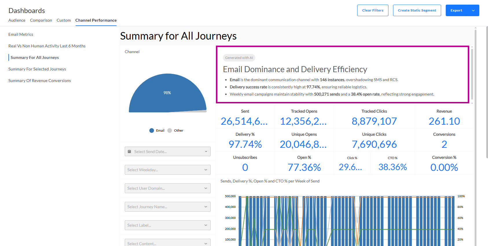
2. When applying a filter to the same Dashboard — selecting Sunday as weekday — the AI-generated summary gets automatically updated, to reflect this selection, leading to the following insights:
Consistent Email Campaign Performance
- Delivery Success Rate: Maintains a high 97.74%, indicating strong operational efficiency.
- Engagement Stability: Both open and CTO percentages are steady at 38.36%, showing consistent recipient engagement.
- Send Volume: Remains stable around 500,271, with no significant fluctuations, suggesting a well-optimized strategy.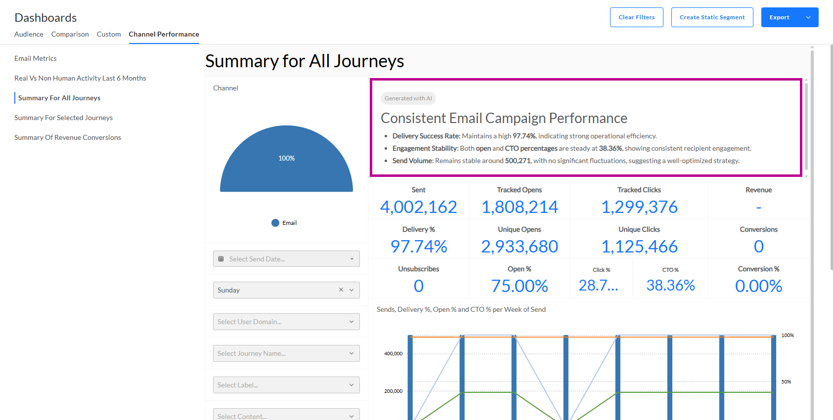
More examples of AI-generated summaries are included in the detailed Dashboards articles following this topic.
 Related Topics