
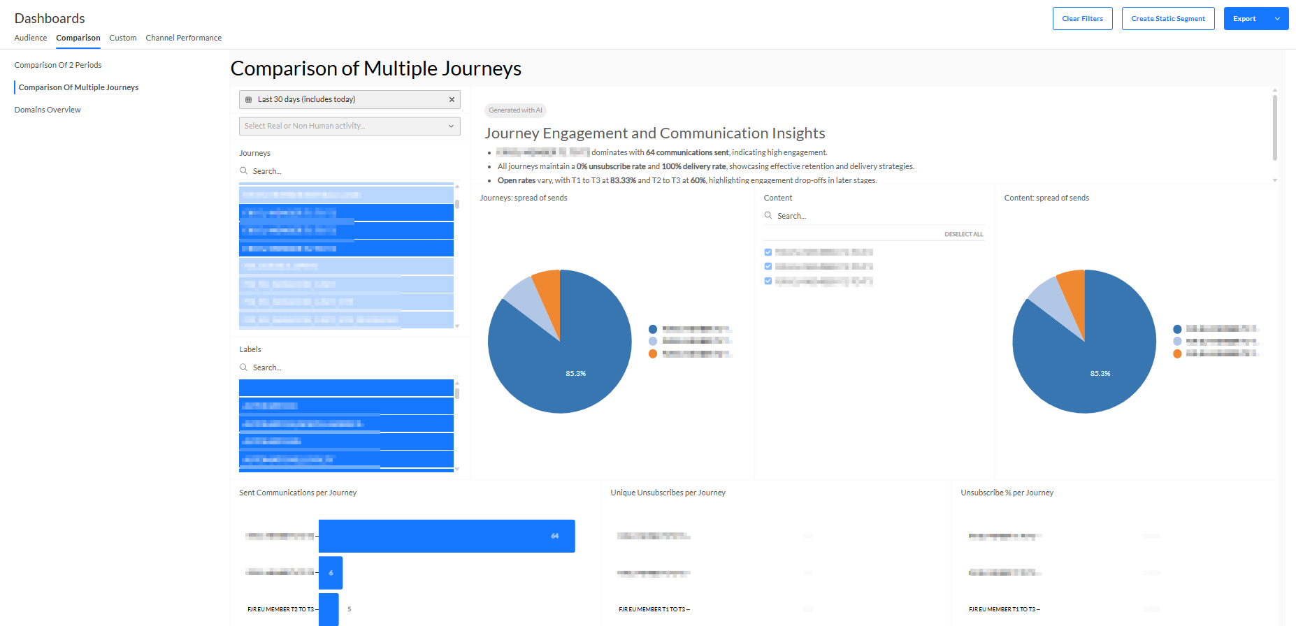
The Comparison of Multiple Journeys tab provides a dashboard in which you can compare performance metrics of different journeys.
- An AI-generated summary of this dashboard is displayed at the top.

- Select Send date — A range can be selected, to filter the performance info to be shown over a specific period based on the send date. One of the following presets can be chosen : today, this month, last 7 days, last 30 days, last 60 days, last 90 days, or a custom range can be defined through date selectors. By default the 30 days preset is selected.
- Select All, Real or Non-human activity — Drop-down via which you can select to filter on all activity (real & non-human combined), real activity (human), or non-human activity (bots).
- By default, reporting is shown on all activity.
- When a filter is set, you can click the x icon to reset the filter, and show all activity again.
- Journey selector — Select journeys that you want to visualize.
- The list shows the most recently executed journeys for the selected period.
- You can select as many journeys as you want.
- You can also search for a specific journey name by entering text in the search field on top to reduce the list of journeys.
- By default, no journeys are selected and thus no reporting data is available on the screen.
- When you make a selection, all reporting widgets are dynamically updated.
- When multiple journeys are selected, widgets will show aggregated data for all selected journeys.
Note 1: Selected journeys remain selected after being filtered out of the list after a search.
Note 2: Journeys having the same name appear only once in the list, but selecting the name will select all journeys having that name.
Note 3: Renaming a journey from the Selligent by Zeta user interface does not rename it in the dashboards.
® Contact Zeta support when you need a change. - Journeys spread of sends — Pie chart widget showing comparison of journeys per number of sent communications. Journeys that have a sent value lower than 3% are grouped in an "Other" section.
- Content — Select different content to compare by checking the corresponding content names. By default all content is selected.
- Content spread of sends — Pie chart widget showing comparison of content per number of sent communications. Content with a sent value lower than 3% of is grouped in an "Other" section.
- Sent Communications per Journey — Bar chart showing the number of sent communications grouped per journey. Journeys can be selected/unselected by clicking on the corresponding colored legend block or on the corresponding bar. The 'clear filter' button allows to remove the applied filtering. By default all journeys are selected.
- Unique Unsubscribes per Journey — Bar chart showing the number of communications in which an unsubscribe link was clicked, grouped per journey. Journeys can be selected/unselected by clicking on the corresponding colored legend block or on the corresponding bar. The 'clear filter' button allows to remove the applied filtering. By default all journeys are selected.
- Unsubscribe % per Journey — Bar chart showing the percentage of communications in which an unsubscribe link was clicked, grouped per journey. Journeys can be selected/unselected by clicking on the corresponding bar. The 'clear filter' button allows to remove the applied filtering. By default all journeys are selected.
- Delivery % — Bar chart showing the percentage of communications that have been successfully delivered, grouped per journey. Journeys can be selected/unselected by clicking on the corresponding bar. The 'clear filter' button allows to remove the applied filtering. By default all journeys are selected.
- Open % — Bar chart showing the percentage of delivered communications that have been viewed or clicked, grouped per journey. Journeys can be selected/unselected by clicking on the corresponding bar. The 'clear filter' button allows to remove the applied filtering. By default all journeys are selected.
- CTO % — Bar chart showing the percentage of opened communications that have been clicked, grouped per journey. Journeys can be selected/unselected by clicking on the corresponding bar. The 'clear filter' button allows to remove the applied filtering. By default all journeys are selected.
- Grid overview — Overview of all the metrics, per journey and per message :
- Sent — Number of communications that are actually sent to an audience.
- Unsubscribes — Number of clicks on unsubscribe links that occurred for the message.
- Delivery % — Percentage of communications that have been delivered successfully.
- Opens — Number of communications that are viewed (every tracked open counts as a new view).
- Open % — Percentage of delivered communications that have been viewed or clicked.
- Click % — Percentage of delivered communications in which one or more links have been clicked.
- CTO % (Click-to-open percentage rate) — Percentage of opened communications that have been clicked.