Global Insights
Insights help you understand the key metrics and performance indicators of your Experiences over a selected time period.
Grow offers global insights on all of your Experiences as well as more detailed Experience-level insights.
This article will explain the global insights that are available to you.
Global insights
Note: Insights are available from 10 minutes to an hour after Experience interactions occurred.
To access the global insights, you can either:
-
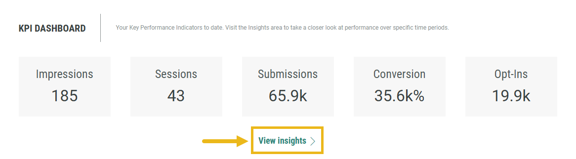
Click View insights in the KPI Dashboard summary on the Dashboard tab.
-
Click the Insights tab in the main navigation bar.

The Insights screen is then presented.
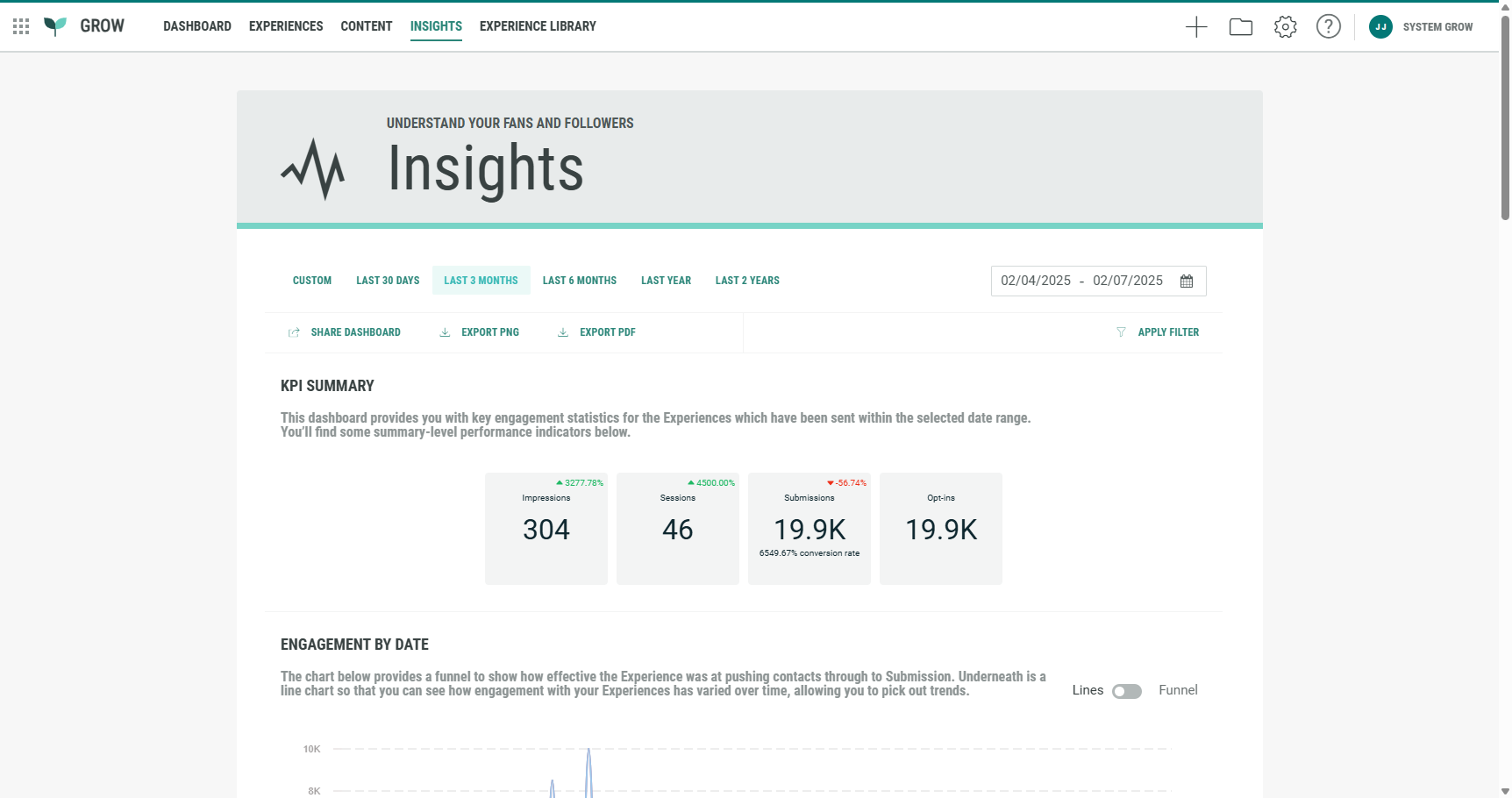
It contains the following sections:
- Date range selection
- KPI summary
- Engagement by date
- Conversions by date
- Cumulative engagement over time
- Access report
- Detailed Experience performance
Date range selection
At the top, select the date range for which you want to see insights on.
The selection applies to all insights on the page.

You can set one of the following date ranges: Custom, Last 30 days, Last 3 months, Last 6 months, Last year, Last 2 years.
-
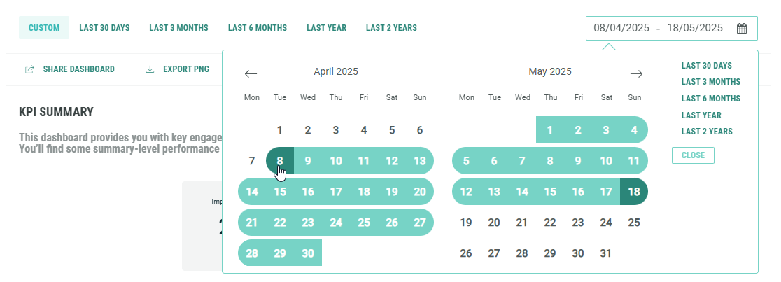
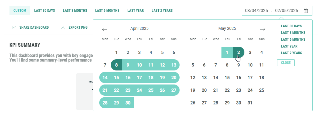
Custom is applicable when you manually select start and end dates from the date picker.
-
Start date — Click on the start (left) date. Click on an arrow to navigate between months and click on the desired date. The start date shown gets updated with your selection.
-
End date — Click on the end (right) date. Click on an arrow to navigate between months and click on the desired date. The end date shown gets updated with your selection.
-
-
All other options are fixed date ranges.
Regardless of which date range you select—for example, the last 3 months or the last 2 years—fixed date ranges are always based on today's date.
Note: For the last 30 days date range, an actual count is performed 30 days back from today's date. It does not mean month to date, as it depends on the number of days in the applicable month(s).
For example, if today it's March 1st 2025, then the last 30 days date range goes back to January 31st.
Action bar

Under the date range selection, there's a a bar with the following actions:
-
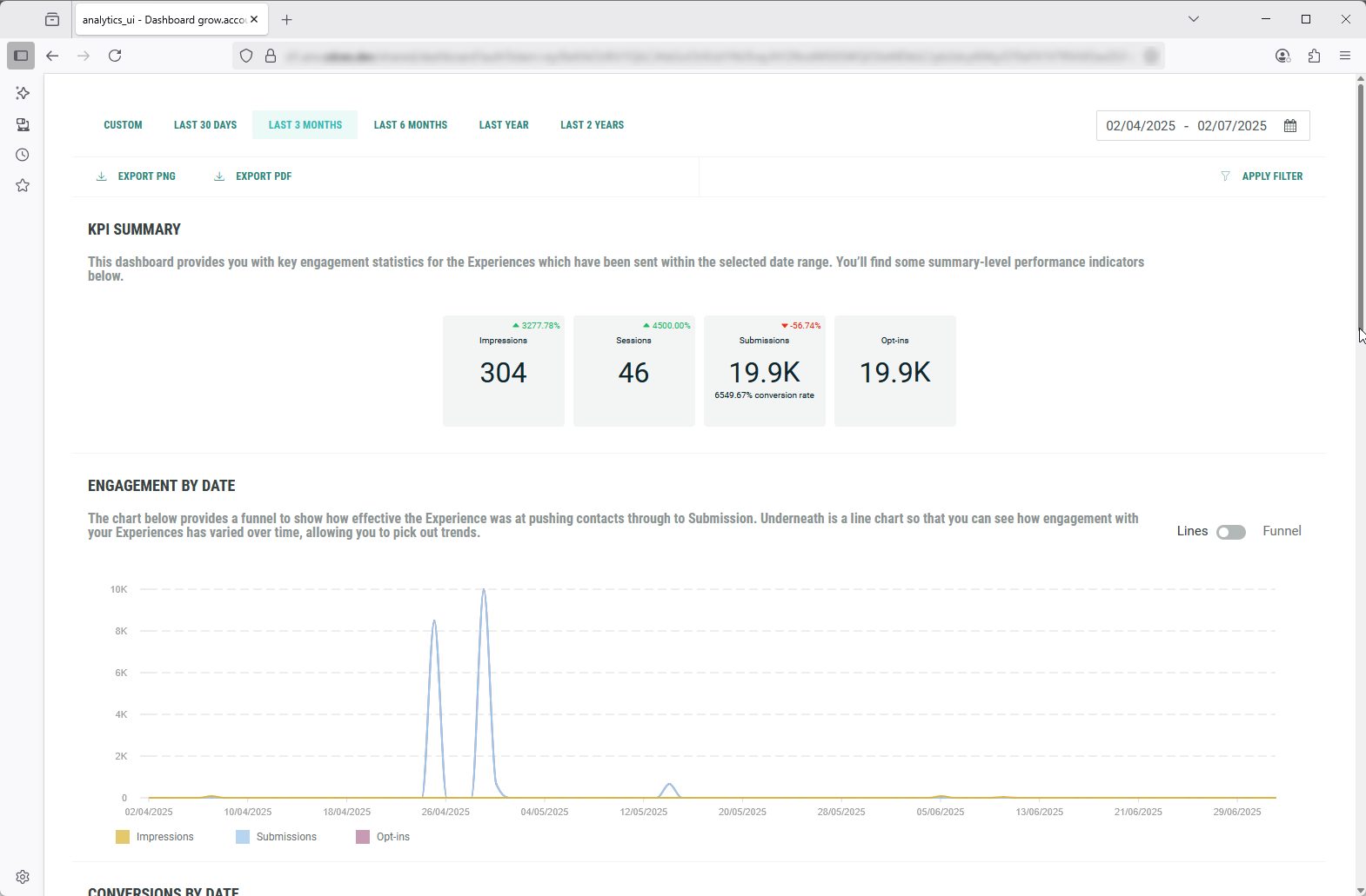
Share Dashboard — Clicking this option shows a pop-up in which you can copy the link to the Insights dashboard (with applied filters) to your clipboard. Note that the link has an expiration date, which you can change if desired.

The link can then be shared with others.
When they open it, they will only see the Insights dashboard, without any of the Grow UI navigation and header elements.
Example:
-
Export PNG — Clicking this option downloads the complete Insights dashboard (with applied filters) as a PNG image file onto your local computer.
-
Export PDF — Clicking this option downloads the complete Insights dashboard (with applied filters) as a PDF document onto your local computer.
-
Apply Filter — Clicking Apply Filter shows a pop-up in which you can set one or more filters.
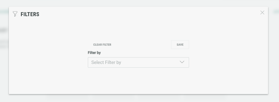
You can filter by browser, device type, Experience name, Operating System, source.
When selecting one or multiple of these filters in the Filter by field, an additional field is shown for each selected filter.
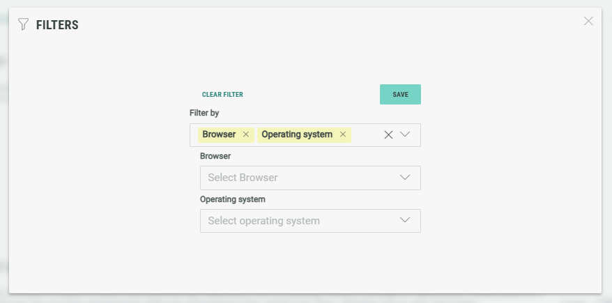
The following selections can then be made in the filter-specific fields (again, one or multiple can be selected per field):
- Browser: Others, Chrome, Unknown.
- Device type: Desktop, Unknown.
- Experience name: A list of all available Experiences in your Grow account.
- Operating System: Windows, Others, Unknown.
- Source: This depends on the used source parameters. (Also see the Global Insights section below).
Example: I only want to see Insights for 2 specific Experience names, and only for when participants accessed those through a Chrome browser on a desktop device, and when they contained a source parameter equal to web.
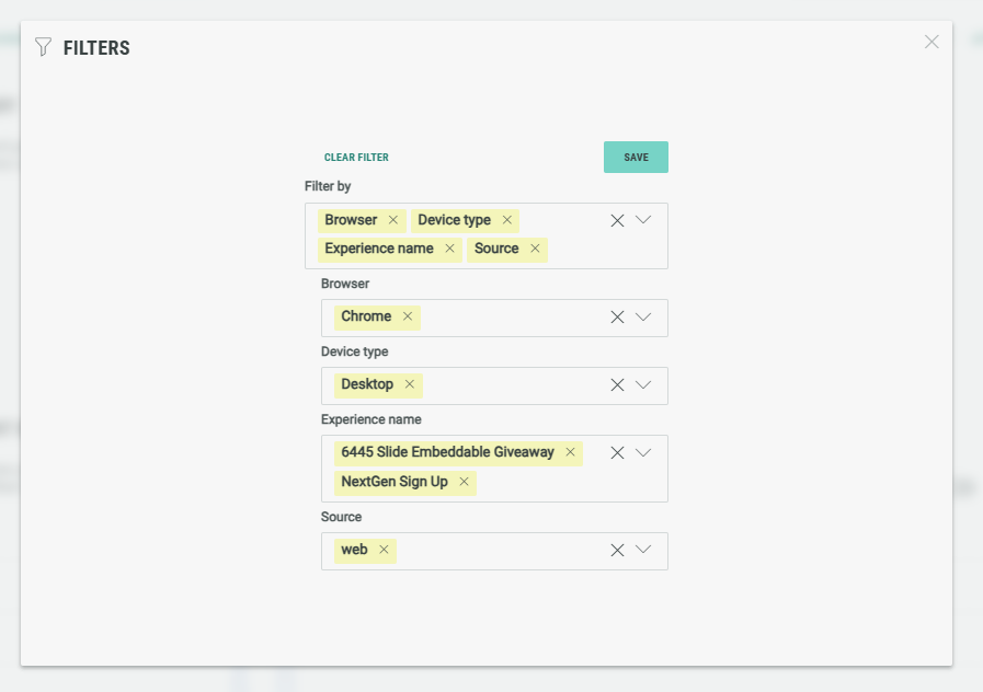
Click the Save button at the top-right to apply the filters. The pop-up is then closed and the Insights are updated with your filters applied.
You can click on the cross icon at the top-right of each selected filter to remove them.
If you want to remove all filters at once, click the Clear Filter button at the top-left of the pop-up.
KPI summary
The KPI summary provides key engagement statistics for the Experiences which have been sent within the selected date range.
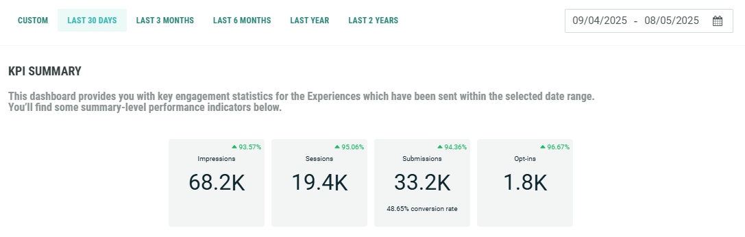
The following Key Performance Indicators are shown:
- Impressions — The number of times the Experience has been fully loaded on-screen.
- Sessions — The number of registered sessions. A session is registered when an engagement occurs. This might be a button click, populating a text field, or scrolling to the next question.
- Submissions — The number of forms that are completed (= filled in all required fields) and submitted by entrants.
- Opt-ins — The total number of entries where the entrant consented to one or more opt-ins.
Each KPI shows the value in the middle.

Submissions additionally show the conversion rate at the bottom.
The conversion rate is the number of submissions (=completed forms) divided by the number of impressions (=Experience entries on-screen).
For all KPIs, depending on the active date range, at the top-right an evolution rate may be shown.
This rate is the evolution of the KPI compared to the previous period (of the same range).
Note: Positive and negative rates may be visible, depending on the evolution per KPI.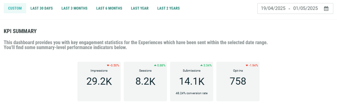
No evolution rate is shown for KPIs when there's not sufficient data to compare with.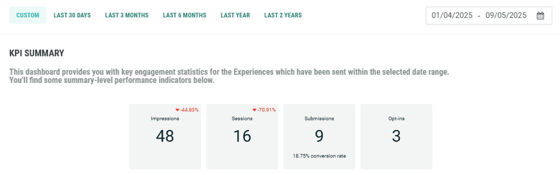
Example: When the date range last 30 days is selected, and the evolution rate of submissions shows a positive evolution of +87.30%, this means that compared to the 30 days before, submissions (=completed forms) are increased by 87.30%.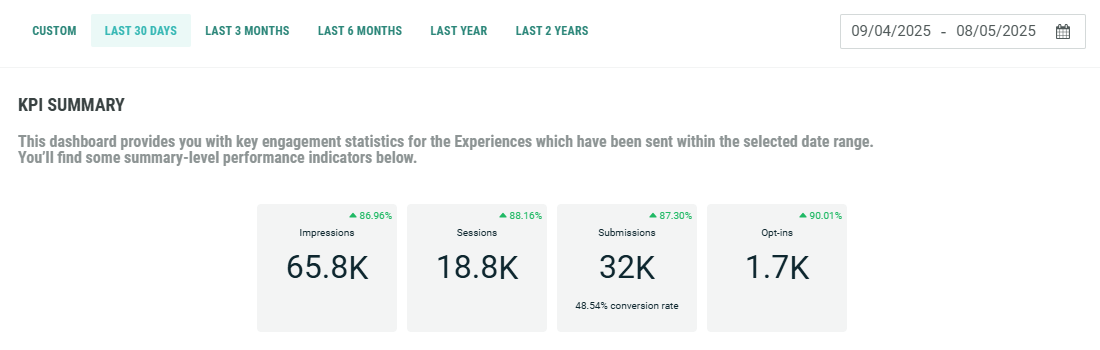
Engagement by date
Engagement by date shows how effective the Experience was at pushing participants through to submission (=submitted the form).
There are two ways to view the engagement by date: Lines or Funnel. Use the toggle at the top-right to switch between these views.
|
|
-
Lines — The line chart visualizes how engagement with your Experiences has varied over time, allowing you to pick out trends.
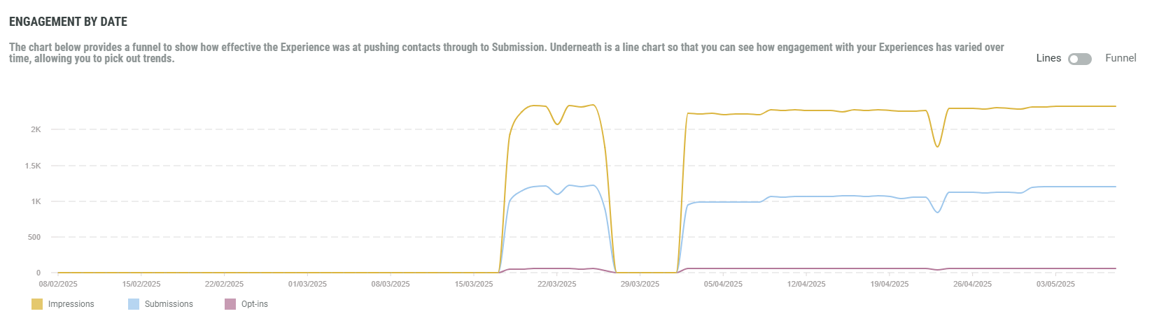
The Lines chart shows the following KPIs: impressions, submissions and opt-ins.
You can view / hide any of these in the chart, by clicking on the corresponding filters underneath.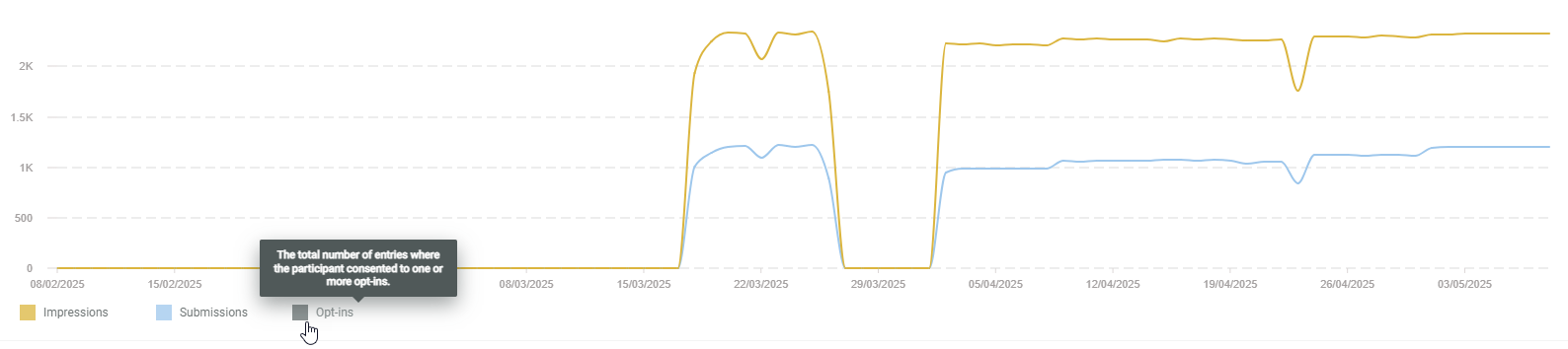
Hovering with the mouse cursor over a chart shows info in a tooltip about the KPI type, and its value (vertical axis) for the specific date (horizontal axis).
-
Funnel — The funnel view shows the totals per KPI within the selected date range. It's in the form of a conversion path, starting with impressions (participants entering the Experiences), moving into submissions (forms completed by participants), and ending with opt-ins (entries where the participant consented to one or more opt-ins).
This view allows you to identify where drop-offs occur. It breaks down the journey into sequential stages, allowing teams to measure how many participants complete each step and where they abandon the process.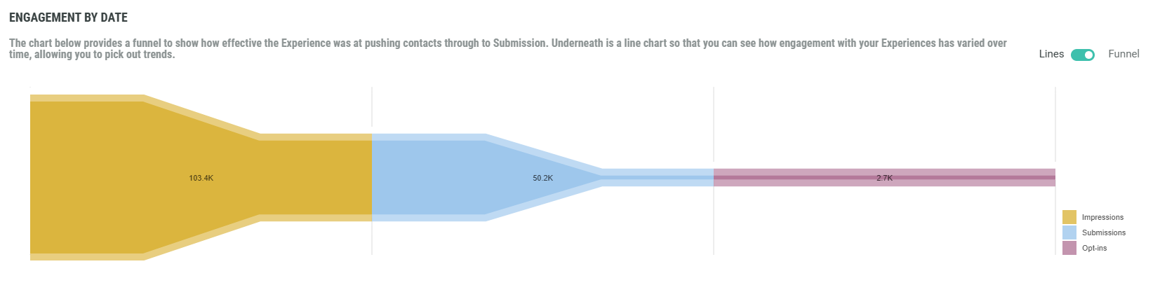
Conversions by date
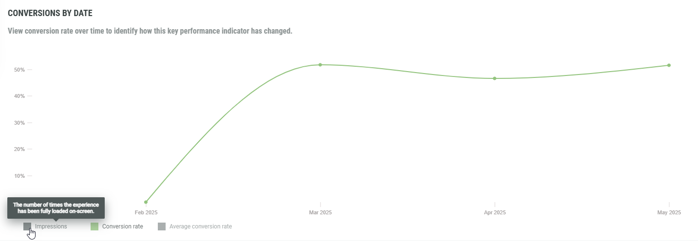
This chart gives a view on conversion rate over time to identify how this KPI has changed.
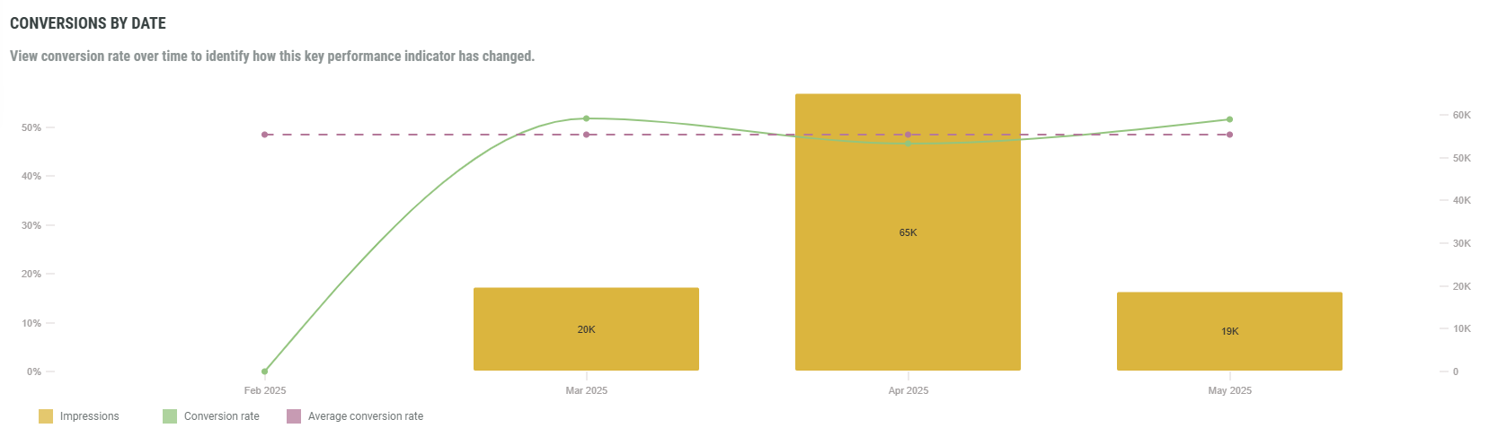
- Impressions — Bar charts, showing the number of times the Experience has been fully loaded on-screen.
These are per month for all date ranges, except for the last 2 years for which these are per year instead. - Conversion rate — Line chart with the proportion of impressions that resulted in submissions (= forms completed) over time.
- Average conversion rate — The average conversion rate across the selected date range, shown as a horizontal dashed line.
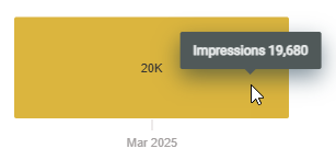
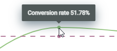
Hovering with the mouse cursor over a bar chart or a dot on any of the line charts, shows info in a tooltip about the KPI, and its value or percentage (vertical axis) for the specific month or year (horizontal axis).
|
|
You can view/hide any of the charts, by toggling the corresponding filters.
Cumulative engagement over time
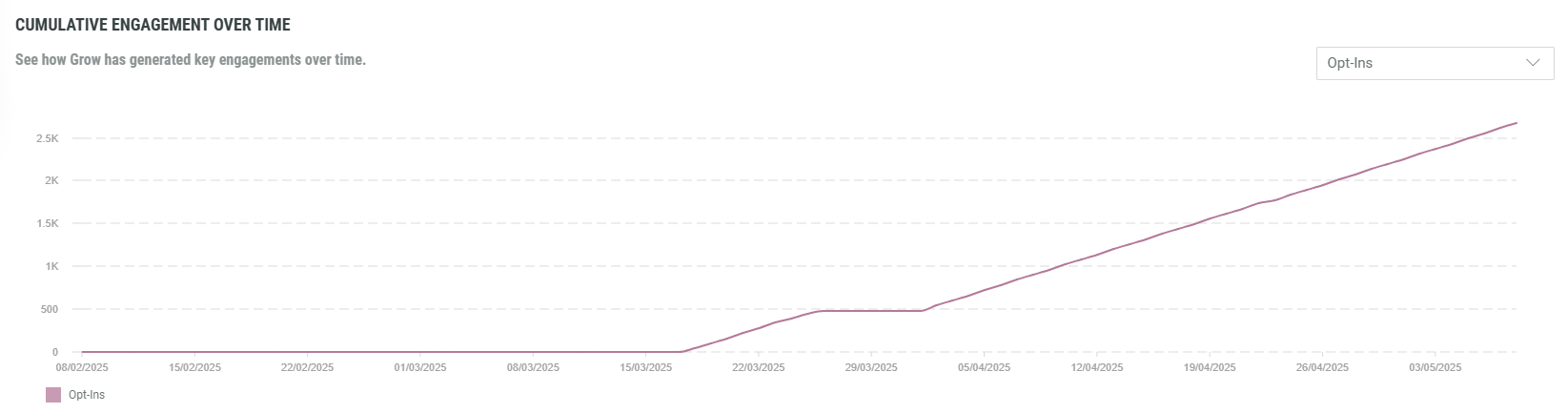
See how Grow has generated key engagements over time, presented in a line chart by KPI.
The values are cumulative, meaning each data point includes all previous engagement. As a result, this chart only shows stagnating or upward trends.
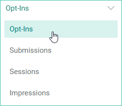
You can select a KPI from the drop-down at the top-right. (The KPIs are explained above)
The line chart automatically updates to your KPI selection.
The horizontal axis shows the dates, depending on the selected date range at the top, and what fits on your screen.
Example:
- Opt-ins for the last 3 months.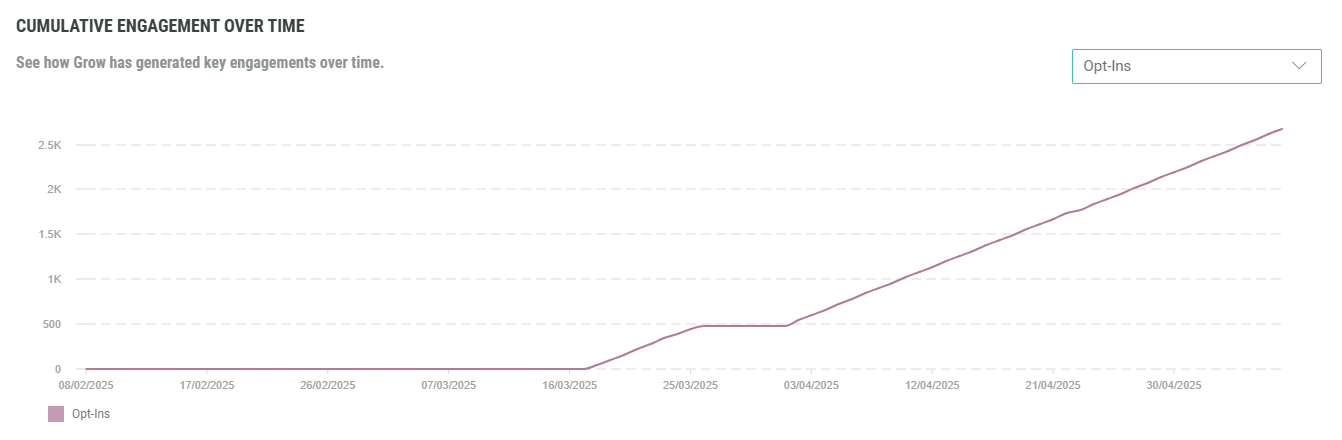
- Opt-ins for the last 3 months, shown on a smaller screen. (less dates are shown, with a bigger gap in between the dates)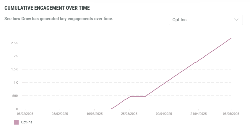
- Submissions for the last 2 years.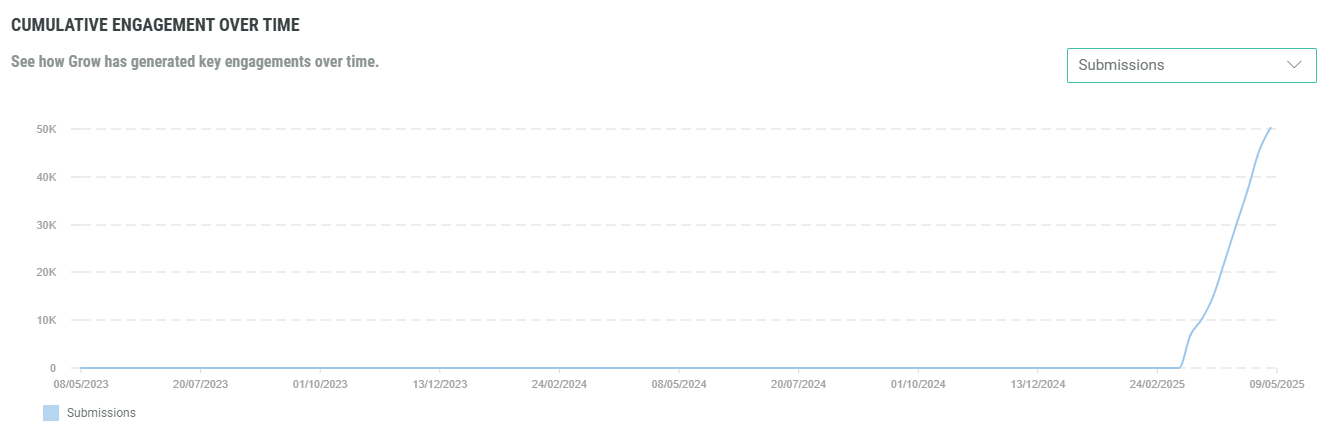
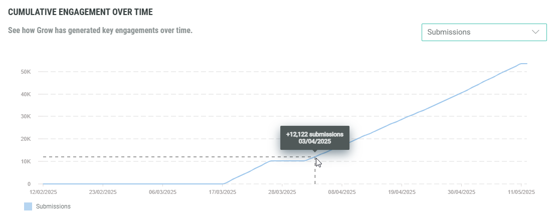
Hovering with the mouse cursor over the line chart shows info in a tooltip about the KPI and its value (vertical axis) for the specific date (horizontal axis).
Access report
The access report shows how engagement activities for your Experiences are spread across different devices, operating systems or browsers.
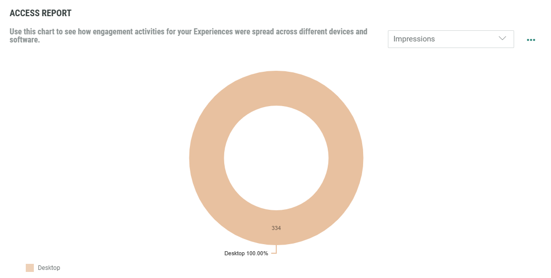
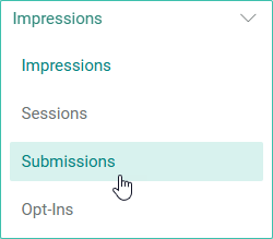
At the top-right, you can select a KPI from the drop-down. (The KPIs are explained above)
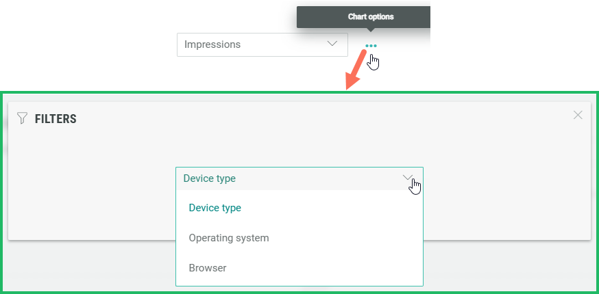
Next to the drop-down, you can click on the 3 dots to filter the data on device type, operating system or browser.
The pie chart automatically updates to your selections.
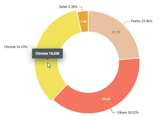
Example:
Submission is selected as KPI and browser is selected as filter.
For the selected date range at the top, the pie chart shows values and percentages per browser.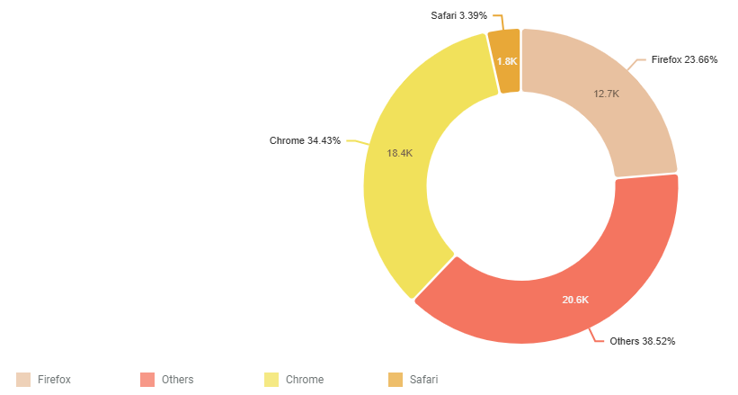
Hovering with the mouse cursor over a piece of the pie chart shows a tooltip with the browser and exact KPI value.
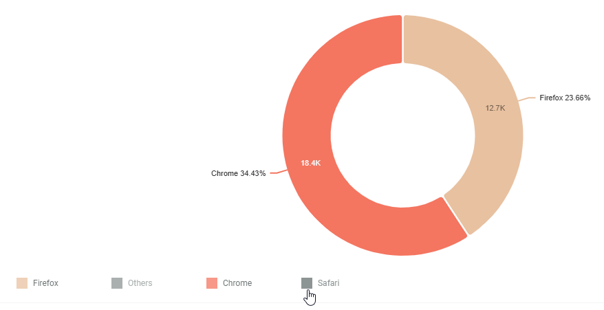
You can view/hide any of the pie chart pieces, by toggling the corresponding filters.
Detailed Experience performance
A table view allows you to view and compare the performance of Experiences for the selected date range.
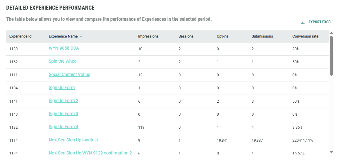
Per row there's one Experience.
Per Experience, the following values are available (in columns):
- Experience ID — The unique identifier of the Experience.
- Experience Name — The name of the Experience.
- Impressions — The number of times the Experience has been fully loaded on-screen.
- Sessions — The number of registered sessions. A session is registered when an engagement occurs. This might be a button click, populating a text field, or scrolling to the next question.
- Opt-ins — The number of entries where the entrant consented to one or more opt-ins.
- Submissions — The number of forms that are completed and submitted by entrants.
- Conversion rate — The percentage of impressions that resulted in submissions (= forms completed).
You can click on an Experience name to navigate to the insights specific to that Experience.
The table can display a maximum of 100 rows. You can scroll through them using the vertical scroll bar on the right.
When more than 100 rows are available, pagination is available at the bottom to navigate and view the rows on different pages.

You can sort the table by clicking on any of the arrows that appear in the column headers when hovering over them.
Clicking multiple times on the same one, toggles between ascending and descending sorting.
Example:
- Sort on the number of impressions in ascending order.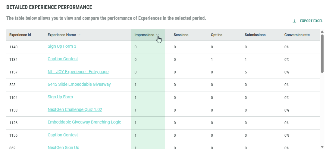
- Sort on the number of opt-ins in descending order.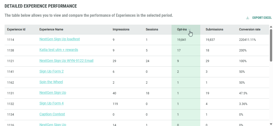
At the top-right, there's a link to export the table to a .CSV file onto your local computer.