Experience Level Insights
Insights help you understand the key metrics and performance indicators of your Experiences over a selected time period.
Grow offers global insights on all of your Experiences as well as more detailed Experience-level insights.
This article will explain the Experience-level insights and how to access them.
Experience-level insights
Insights on individual Experiences can be accessed:
-
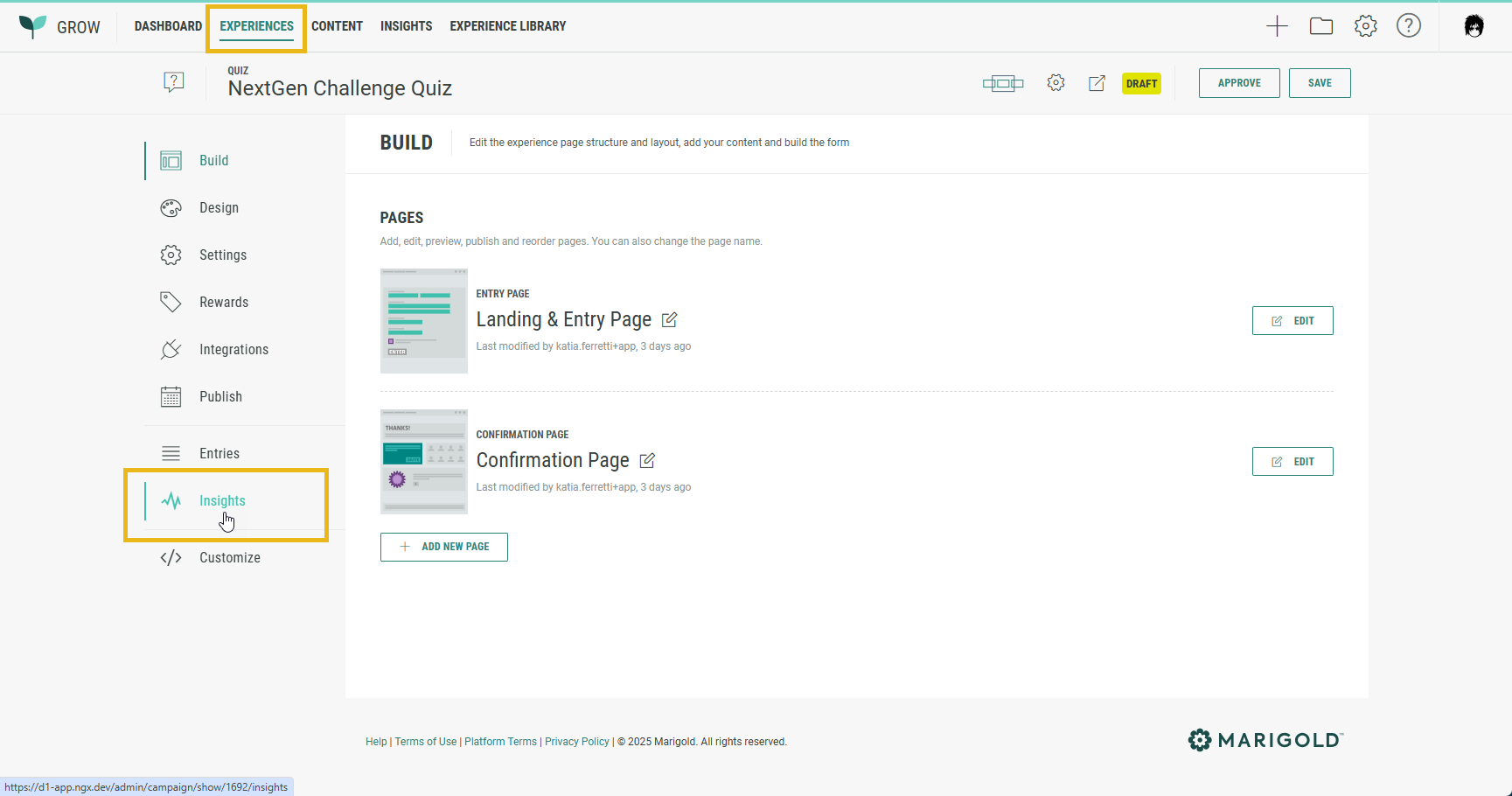
By navigating to Experiences in the top navigation, selecting an Experience and clicking on Insights in the left-hand side navigation of that Experience.
- by navigating to Insights in the top navigation, and clicking on the Experience name in the Detailed Experience Performance grid.
Experience-level insights provide the following tabs:
Overview
The Overview tab provides comparable insights as the global insights, but instead of giving a view on all Experiences, it's specific to the selected Experience.
The following sections are identical to those seen within the global insights:
- Date range selection
- KPI summary
- Engagement by date
- Conversions by date
- Access report
For more information on these sections, see our Global Insights guide.
Besides the ones mentioned above, there are two additional sections that only apply to Experience-level insights:
- Source analysis — Only displays if you've included a source parameter.
- Cumulative rewards granted — Only displays if you're using Rewards. xs
Source analysis
See how engagement varies across different sources.
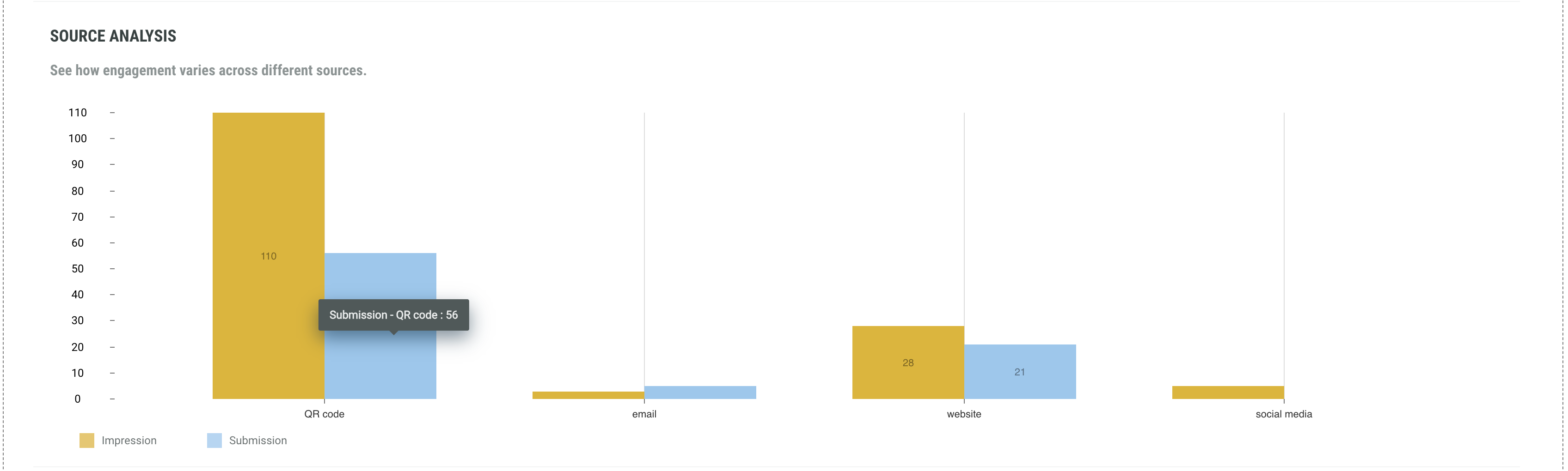
These insights are user-defined. Data will only be available when a source parameter is included.
Please consult the Attribution (Tracking) help topic to learn more about this subject.
Example: https://example.com/page?source=social%20media
The bar charts show the number of impressions and submissions per source.
Cumulative rewards granted
A Reward is an incentive offered to customers for participating in a Grow Experience, with the ultimate goal of learning something new about that customer or driving engagement with your brand. Rewards, like prizes, offers, or coupons, can be provided in real-time and have been shown to boost overall engagement. They can be structured as everyone wins or with set odds with consolation rewards as an option. Inclusion of a reward in your experience will boost participation.
Note: Find more info on Rewards here.
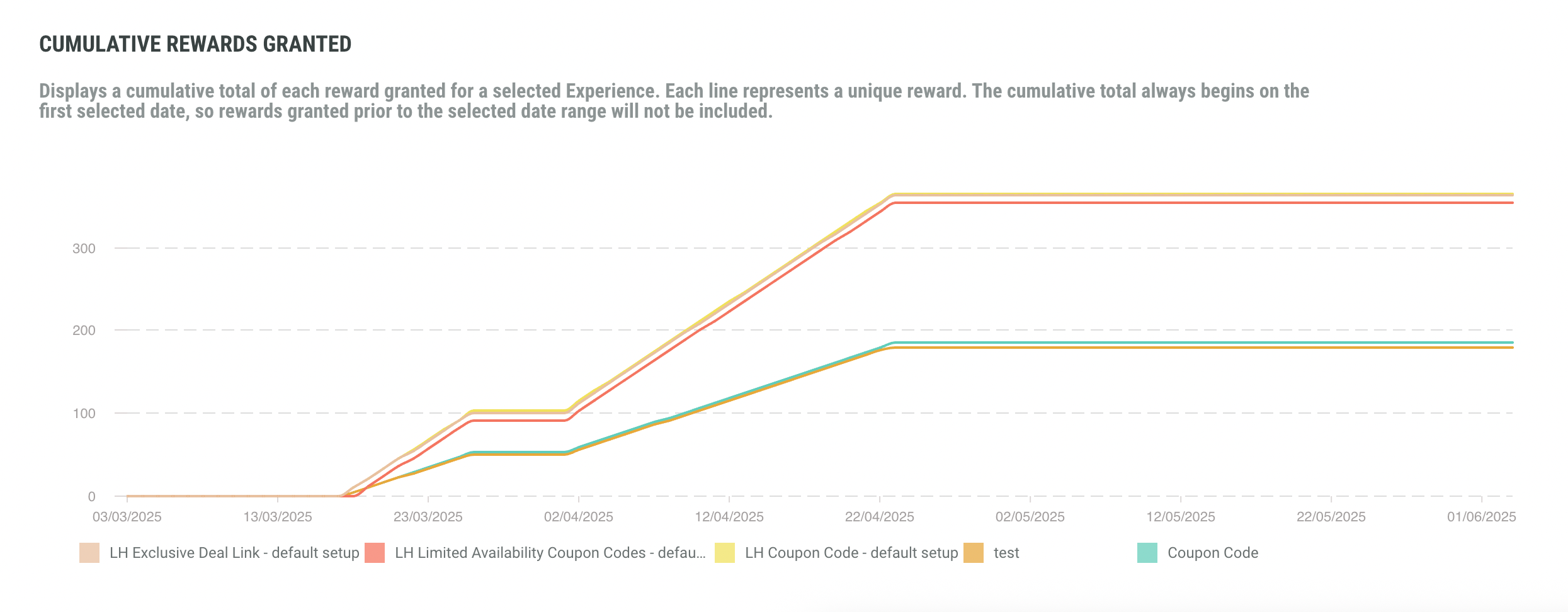
This chart displays the cumulative total of each reward granted for the selected Experience.
Each line (and each filter at the bottom) represents a unique reward.
The lines show the total count of each reward granted prior to the date range and how that total changed over the selected period.
Note: For Macro (legacy) Experiences, the Overview tab is called Activity instead.
Performance
The Performance tab provides breakdowns per page and per slide.
Note: The following chart colors are being used:
- Green for the Landing & Entry page and slides.
- Red for any Content pages and slides.
- Grey for the drop-off rates (pages and slides).
Performance per page
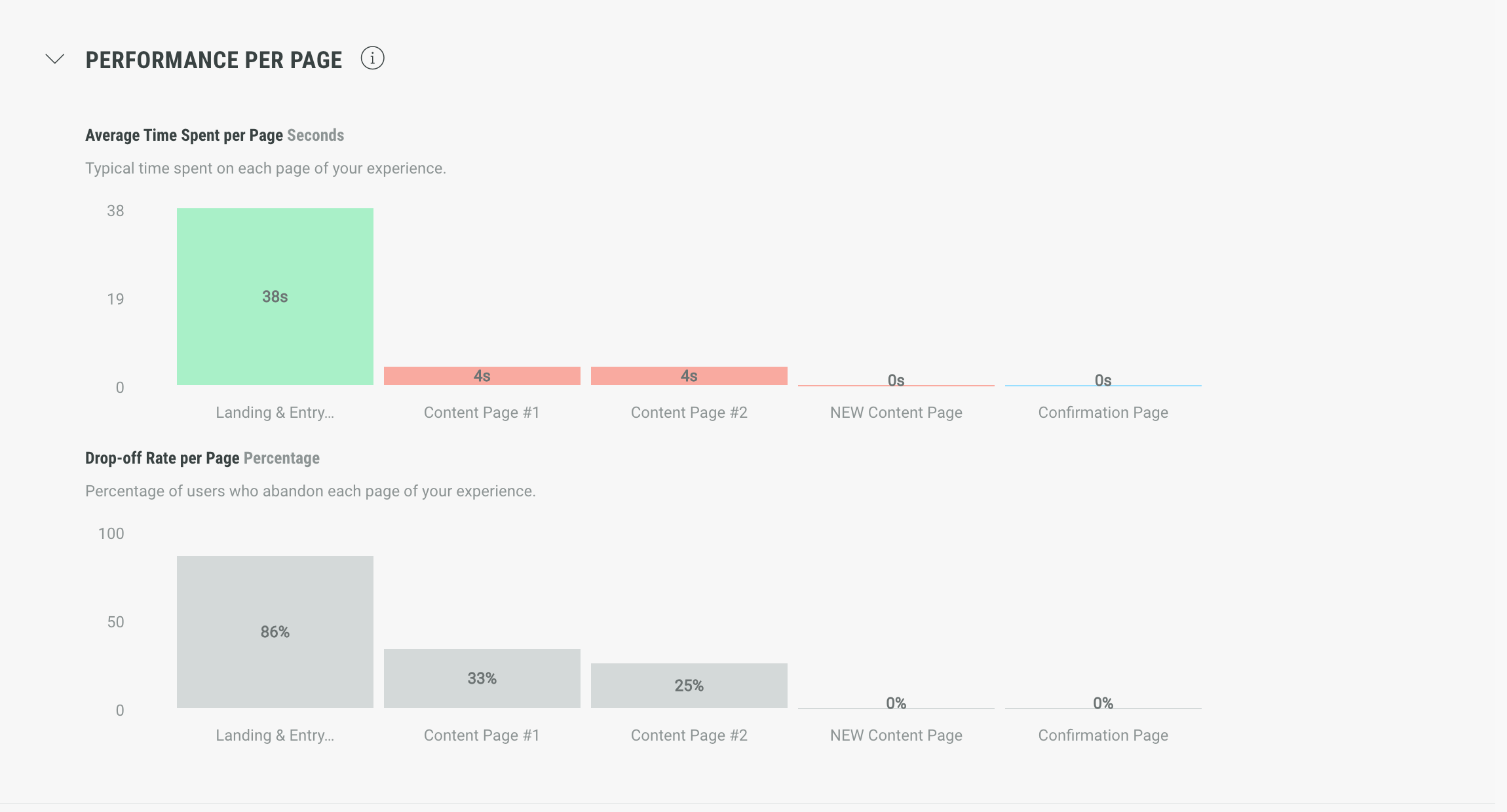
Performance per page offers charts with insights for your pages:
-
Average time spent per page — The average time spent on each page of your Experience.
Example: The Landing & Entry Page has an average of 38 seconds, while the next pages only have an average between 0 and 4 seconds.
-
Drop-off rate per page — The percentage of users who abandon each page of your Experience.
Example: The abandon rate on your Landing & Entry Page is 86% (which means 86 percent of users accessing the Landing & Entry Page, abandon it), while the abandon rate on page 2 is 33%, on page 3 it's 25%, and other pages after have a drop-off rate of 0%.
As the Landing & Entry Page has a high drop-off rate, this could mean that you need to improve the page in your Experience, so that participants are less likely to drop off.Note: The drop-off rate of the Confirmation Page is always 100% when at least 1 participant completed the Experience, or 0% when no one has completed the Experience yet.
Performance per slide
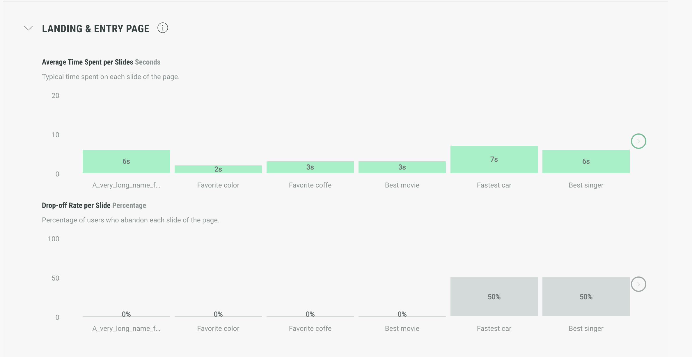
The Performance per slide section offers charts with specific performance insights for each slide used per page.
Note: Each page has its dedicated section that can be expanded/collapsed to see the performance per slide for that page.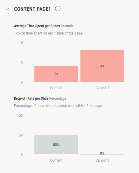
-
Average time spent per slide — The average time spent on each slide of the page.
Example: Slide 1 has an average time of 2 seconds, slide 2 has an avg time of 4 seconds, and so on.
-
Drop-off rate per slide — The percentage of users who abandon each slide of the page.
Example: The abandon rate on slide 1 is 50% (which means 50 percent of users accessing slide 1, abandon it), slide 2 has an abandon rate of 0%, etc.
Note: If there are more pages and/or slides than can fit on the screen, a horizontal scrollbar appears, allowing you to scroll through them. You can also navigate using the left and right arrows.
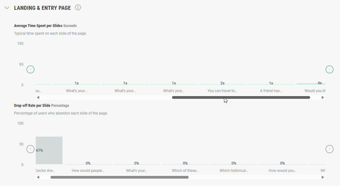
The combination of the values in each performance breakdown offers a strong view on how the pages and slides in your Experience perform.
For example, if 67% of users accessing the Landing & Entry Page, abandon that page, and the drop-off rate on slide 2 of the Landing & Entry Page is very high, you know that slide 2 needs to be improved in the Experience to keep the participants engaged.
Real-time
The Real-time tab provides live insights about the Experience.
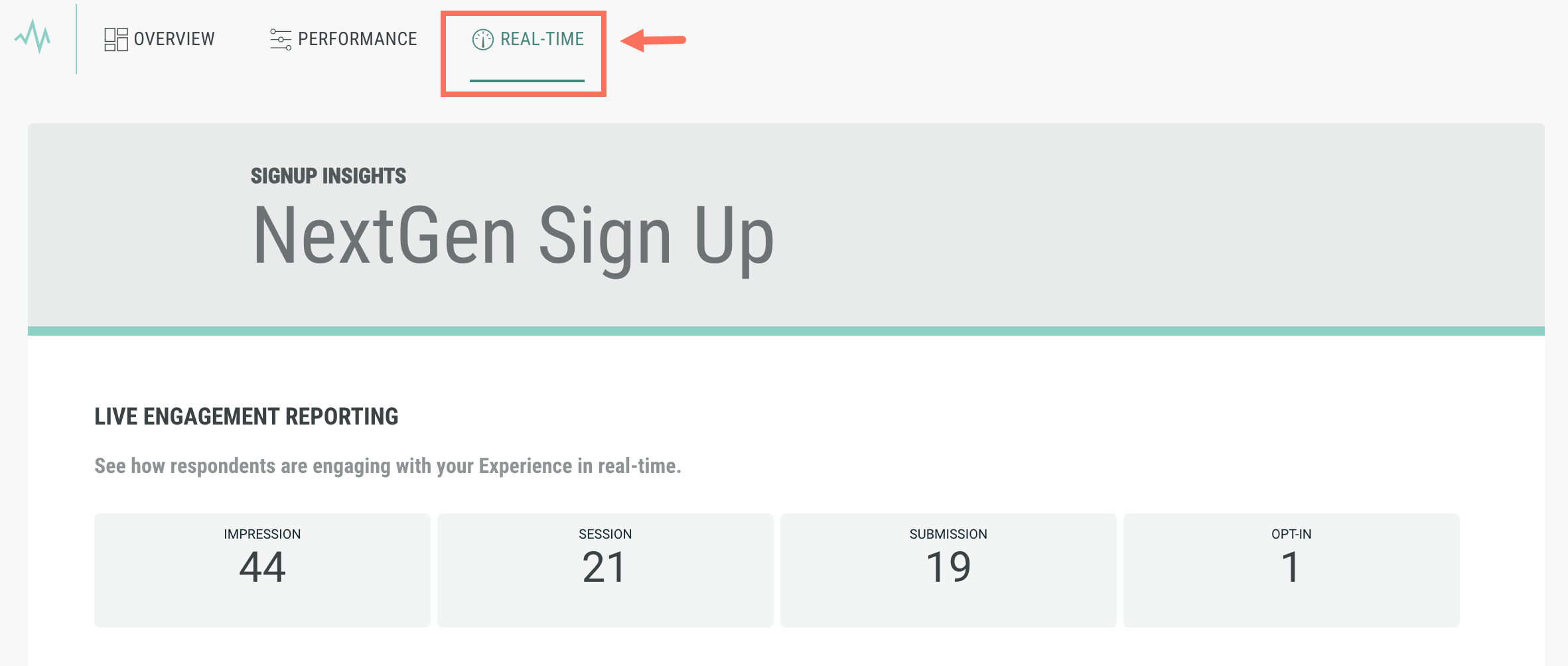
Example: These live insights show a total of 5 impressions and 3 submissions.
At the time we checked the live insights (16:03), we saw 1 impression (marked by the blue spike) followed shortly by 1 submission (the green spike).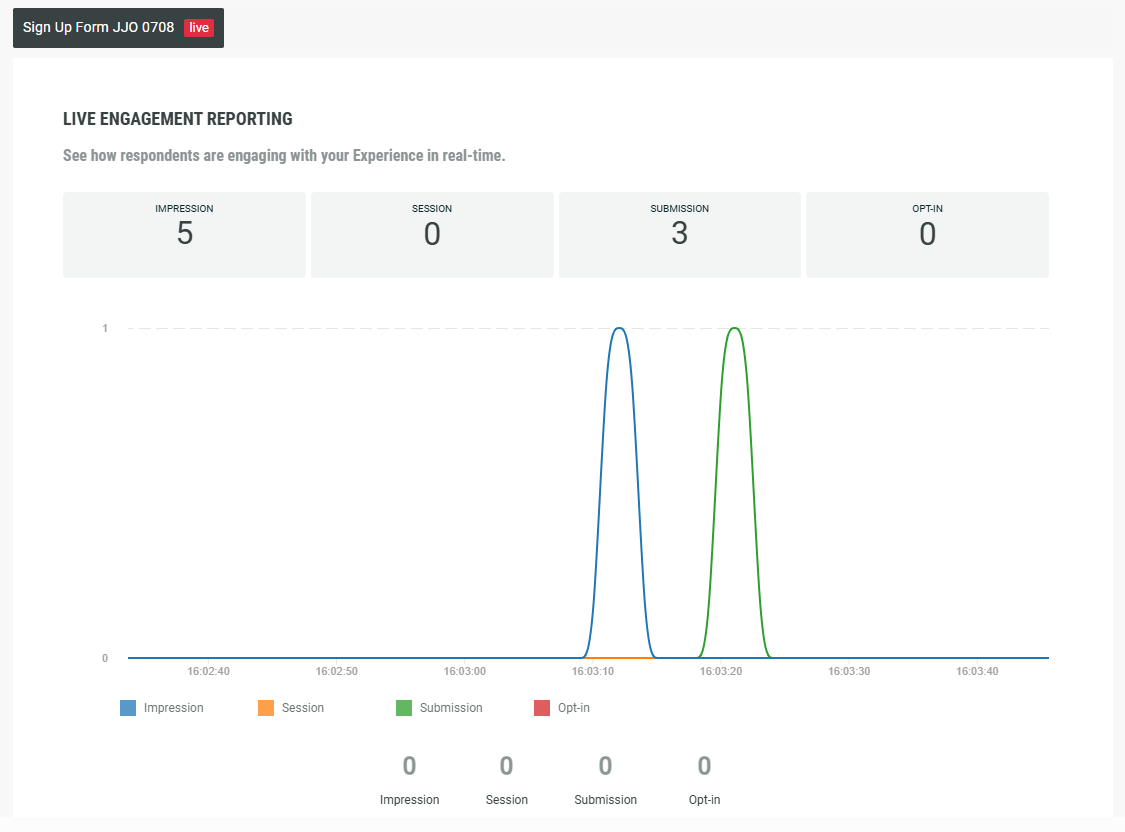
These real-time insights show an animated live chart, that continuously displays the current time.
The video below showcases the real-time insights after viewing the Experience and submitting the Experience form. The exact moments when the impression and submission events took place are visible with the spikes in the chart.
The filters underneath the live chart can be enabled/disabled to show/hide certain events.

Responses
If your Experience includes question modules, you will see the associated data within the Responses tab.
Note: This only includes data for closed-end question types including single choice, multiple choice, dropdowns, rating scales, swipeable quiz, opt-in, and multi-opt-in. Any responses from open-ended questions are not included in the data shown on this screen.
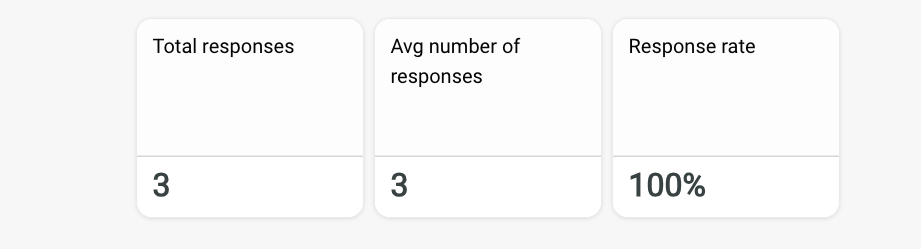
The KPI tiles show:
-
Total responses - the total number of answer responses collected across all participant entries
-
Average number of responses - the average number of questions answered by each participant
-
Response rate - the average percentage of questions answered by participants across the Experience
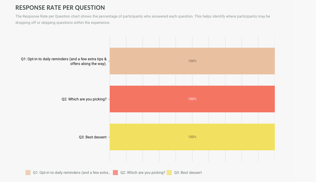
The Response Rate per Question chart shows the percentage of participants who answered each question. This helps identify where participants may be dropping off or skipping questions within the Experience.
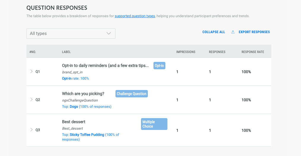
The Question Responses table below provides a breakdown of responses for supported question types, helping you understand participant preferences and trends.
Use the dropdown menu to filter for the different question types and expand each entry to view additional details.