
Content Designer
The Content Designer provides a graphical, user-friendly interface for building email content. The Content Designer is primarily intended to be used by marketers who prefer not to work with HTML. The Content Designer automatically produces responsive email messages that adapt automatically to small screens, such as that of a smartphone.
Note: The Zeta Help Center provides access to a wide range of enablement videos on many Zeta solutions that you can take as needed. Click here to browse to the video on how to use the Content Designer.
Structure vs. content
For maximum flexibility, the Content Designer separates the structure of the message from its content. This means, for example, that you can have rows of content that use different formatting for different sections of the message (e.g. full-width background colors, a different number of columns, etc.) without negatively impacting the responsiveness of the message on mobile devices.
The Content Designer is divided into two main areas: the main message editing stage in the center of the screen (referred to as the "Workspace"), and a panel on the right. The right-hand panel serves a dual purpose -- a menu of element types, and a set of properties and options available for a selected element.
In general, you drag content elements from the right-hand menu, and drop them onto the Workspace. The tool uses highlighting and the label "Drag it here" to help guide you toward valid drop targets. If you then click on the element within the Workspace, the property options specific to that element type are displayed in the right-hand panel.
In addition to the content (text, images, etc.), the Content Designer allows you to define the structural elements (rows, columns) in your email message. Rows with different structures allow you to organize content in a way that is different from the preceding and following rows. For instance, you may need:
- a single-column row with a large image to introduce your online store’s new promotion, and
- a two-column row below it to display some of the store’s best-selling products.
Whenever you need to switch to a different number of columns, you will introduce a new section by using the Rows panel.
The right-hand panel is divided into three tabs:
- Content: Select and edit the specific content elements that make up your message, such as buttons, images, personalization, text blocks, Live Clicker etc.
- Rows: Select different structural elements (e.g. a single-column vs. a three-column row) to organize your content.
- Settings: Define overall settings that affect the entire message, such as a default font family.
Access
The Content Designer is not a standalone screen, and therefore isn't directly accessible from the System Tray. The Content Designer is available for the following features:
- The Campaign screen, for Campaigns in the Email channel.
- The Content Block screen, for Content Blocks in the Email channel.
- The Content Block screen, for Content Blocks in Web Pages.
Note: If you don't have the Content Designer feature enabled in your account, the Advanced Editor is displayed, instead of the Content Designer.
Content Designer supports the language that is set within your Cheetah Digital by Zeta profile. The following languages are available for selection
- Japanese
- French
- Spanish
- German
- Portuguese
Working with designs
When you use the Content Designer, you can save the content as a repeatable asset called a "Design." The features related to Designs are described below. You can also manage your Designs from the Designs screen.
In the Content tab, you will be provided with the options to select between Content Designer and Advanced Editor.
Note: Once you select Use Advanced Editor to create the content, you can NOT toggle back to the Content Designer.
Select an existing template from the template library
When building the content for an Email Campaign, you can select an existing Template from the Template Library and use it as the basis for the Campaign. You can choose from over 1500 professionally designed templates.
To use an existing Tempate:
 read more
-
On the Campaigns screen, click the Content tab.
-
Click Use Content Designer.
-
Click Template Library in the displayed options.
-
In the displayed pop-up window search for the required template that is suitable for your campaign, using the search option.
-
Click Preview to preview the required template from the displayed list.
-
In the displayed Preview modal, click Use This Template to use the template. The selected template will be applied to your content. To select another template from the list, click Close.
-
Edit further as required with other Content Designer options or switch to Advanced Editor to use HTML options.
You can save this as a Design in Cheetah Digital by Zeta for future use.
Select an existing design
When you use the Content Designer, you can save the content as a repeatable asset called a "Design." When marketers are building the content for an Email Campaign, they can select an existing Design, and use it as the basis for the Campaign.
read more
To select an existing Design:
-
On the Campaigns screen, click the Content tab.
-
Click Use Content Designer.
-
Click Existing design in the displayed options. The Select Design pop-up window is displayed.
-
Click on the desired Design from the displayed list, or alternatively search for the Design using its Tag.
-
To preview the Design before applying, click Preview.
-
After selecting the required Design, click select.
-
The Content Designer is displayed and populated with the details of this Design.
Create a new design
To create a new Design:
read more
-
On the Campaign screen, click the Content tab.
-
Click Use Content Designer. Then click Create your own in the displayed options. The Content Designer is displayed, with a blank Workspace.
-
Build the content for your new Design (see below for more details on the specific features of the Content Designer tool).
-
Click Save as design. The Save as Design pop-up window is displayed.
-
In the Name field, enter the name of the new Design.
-
Select the folder where you want to save the new Design.
-
Click Save.
Note: To overwrite an existing Design, enter the name of the existing Design in the "Name" field, and select the same folder where the existing Design is saved. The platform displays a warning dialog box; click save and overwrite.
Rename an existing design
When you use the Content Designer and create the Designs for repeatable use in your Campaigns, they are saved in Cheetah Digital by Zeta. You can rename a saved Design as needed.
To rename an existing Design:
read more
-
On the Campaign screen, click the Content tab.
-
Click Use Content Designer.
-
Click Existing Design in the displayed options. The Select Design pop-up window is displayed.
-
Click on the desired Design from the displayed list, or alternatively search for the Design using its name or tag.
-
Select the required Design to be renamed.
-
Click Rename. In the displayed dialog, enter a unique new name for the Design.
-
Click Save New Name. This name must be a unique design name within Cheetah Digital by Zeta.
The Design will be updated and listed with its new name.
Add content elements to a design
To add a Content-related item to your Design:
-
Click the Content tab.
-
Optionally, if you want more space on the screen to build your Design, click the Expand Advanced Editor button. The system collapses several of the user interface elements in order to make the Workspace larger. Click this button again to revert back.
-
Drag-and-drop the desired content item from the menu on the right, into the desired location in the Workspace.
Note: The custom fonts uploaded in the campaign's setting will be available for selection for the Content Elements: Title, Paragraph, List and Menu. This can be selected from the Font family list in the Content Properties. To upload custom fonts, see Email Campaign > Upload Custom Fonts.
Add a title
A Title is a special type of Text Block. The output HTML renders the Title with heading tags "H1," "H2," and "H3."
To add a Title to your Design:
-
Drag-and-drop the Title item into the desired location in the workspace. The system adds a new Title block with the default text: "I'm a new title block."
-
Click the new Title block. The system displays a text editor tool bar with common text-formatting options, such as typeface, color, and links. Enter your text.
-
While the Title block is selected, additional properties for the Title block are displayed in the right-hand pane, allowing you to configure the following properties:
-
Title -- Select a heading style of H1, H2, or H3.
-
Font family and size -- Unlike in a Text Block, these settings are always applied to the entire Title block. If you set the font family to "Global Font," this Title block will inherit the default font family defined under the Settings tab (see "Configure Design Properties" below for more details on the "Settings" tab). By setting Title blocks to "Global Font," you can change the font family for multiple elements at once, just by changing that property in the Settings tab
-
Text color and link color
-
Alignment -- Unlike in a Text Block, this setting is always applied to the entire Title block.
-
Line height
-
Letter spacing -- Define the spacing in pixels between letters, including negative values.
-
Text direction -- Unlike in a Text Block, this setting is always applied to the entire Title block
-
Padding -- Padding settings can be configured for all sides of the selected element. If you need to configure the sides separately, click the "More Options" toggle.
-
Hide item -- Optionally, you can configure this item to be hidden when the recipient views the message on a desktop, or on a mobile device.
-
-
When finished, click the down-arrow icon within the Content tab again to return to the menu of element types.
-
Position your cursor within the text where you want to insert the personalization field.
-
From the text editor tool bar, select More > Add Personalizationand Library Tag. The "Content" pop-up window is displayed.
-
Within the Browse Fields list, navigate to and select the desired personalization field. You can also search for a field using the Search field in the top-right corner of the pop-up window.
-
Optionally, enter a default value for this personalization field in the "Default" text box. The default value is used if a record doesn't have a valid value in the field being used to personalize the message.
-
Optionally select a formatting mask from the Formatter drop-down menu. The formatting mask is used to control the appearance of the text in the personalization field. For example, you can format date fields as "mm/dd/yyyy." The system includes formatting masks for dollar amounts, dates, numbers, and URLs. You can also use a formatting mask to truncate or encode the personalization field.
-
Click Save. The system inserts the Merge Symbol into the text at the current cursor position.
-
Position your cursor within the text where you want to insert the messaging asset.
-
From the text block editor tool bar, select More > Add Personalization and Library Tag. The Content pop-up window is displayed.
-
Click the Library tab.
-
From the Object Type drop-down menu, select the asset type.
-
Browse to and select the desired asset. You can also search for an asset using the Search field.
-
Click Save. The system displays the Merge Symbol beneath the asset icon.
A Merge Symbol is a textual representation of the asset, consisting of the asset's name and Object Reference ID enclosed in double-brackets. For example: {[Logo_Header|8687]}.
-
When finished, click the down-arrow icon within the Content tab again to return to the menu of element types.
Personalization fields
You can also add personalization fields into the text:
A Merge Symbol is a textual representation of the personalization field, consisting of the field name enclosed in double-brackets. For example: {(first_name)}. If you defined a default value above in step 4, this value is also displayed within the Merge Symbol. For example: {(first_name|Customer)}. If you selected a formatting mask above in step 5, the formatting mask is displayed within the Merge Symbol using a special code. For example, the "mm/dd/yy" date field format mask is represented by the code: "d:d." Therefore, the Merge Symbol for this field would be: "{(date_field||d:d)}."
Messaging assets
You can also insert other messaging assets into the text:
Add a paragraph
Enables creating text with multiple font weights, enhanced copy/paste support, quick reformatting and more.
To add a Paragraph to your Design:
-
Drag-and-drop the Paragraph item into the desired location in the workspace. The system adds a new Paragraph block.
-
Click the Paragraph block. The system displays a paragraph editor tool bar.
-
Select the desired options in the tool bar to add and modify text content.
Add a list
Allows you to create easy numbered and bullet lists.
To add a List to your Design:
-
Drag-and-drop the List item into the desired location in the workspace. The system adds a new List block.
-
Click the List block. The system displays a list tool bar.
-
Select the desired list type from the options in the tool bar.
Add a text block
To add a Text block to your Design:
-
Drag-and-drop the Text item into the desired location in the workspace. The system adds a new Text block with the default text: "I'm a new Text block ready for your content."
-
Click the new Text block. The system displays a text editor tool bar with common text-formatting options, such as font, size, typeface, indentation, and links. Enter your text.
Note: From within the text editor tool bar, if you set the font family to "Global Font," this text block will inherit the default font family defined under the Settings tab (see "Configure Design Properties" below for more details on the Settings tab). By setting text blocks to "Global Font," you can change the font family for multiple elements at once, just by changing that property in the Settings tab.
-
While the text block is selected, additional properties for the text block are displayed in the right-hand pane, allowing you to configure the following properties:
-
Text color
-
Link color (the default link color is inherited from the Design properties in the Settings tab; you can optionally override the global settings within an individual text block)
-
Line height
-
Letter spacing -- Define the spacing in pixels between letters, including negative values
-
Padding -- Padding settings can be configured for all sides of the selected element. If you need to configure the sides separately, click the More Options toggle.
-
Hide item -- Optionally, you can configure this item to be hidden when the recipient views the message on a desktop, or on a mobile device.
-
-
When finished, click the down-arrow icon within the Content tab again to return to the menu of element types.
Personalization fields
You can also add personalization fields into the text:
-
Position your cursor within the text where you want to insert the personalization field.
-
From the text editor tool bar, select More > Add Personalizationand Library Tag. The "Content" pop-up window is displayed.
-
Within the Browse Fields list, navigate to and select the desired personalization field. You can also search for a field using the Search field in the top-right corner of the pop-up window.
-
Optionally, enter a default value for this personalization field in the "Default" text box. The default value is used if a record doesn't have a valid value in the field being used to personalize the message.
-
Optionally select a formatting mask from the Formatter drop-down menu. The formatting mask is used to control the appearance of the text in the personalization field. For example, you can format date fields as "mm/dd/yyyy." The system includes formatting masks for dollar amounts, dates, numbers, and URLs. You can also use a formatting mask to truncate or encode the personalization field.
-
Click Save. The system inserts the Merge Symbol into the text at the current cursor position.
A Merge Symbol is a textual representation of the personalization field, consisting of the field name enclosed in double-brackets. For example: {(first_name)}. If you defined a default value above in step 4, this value is also displayed within the Merge Symbol. For example: {(first_name|Customer)}. If you selected a formatting mask above in step 5, the formatting mask is displayed within the Merge Symbol using a special code. For example, the "mm/dd/yy" date field format mask is represented by the code: "d:d." Therefore, the Merge Symbol for this field would be: "{(date_field||d:d)}."
Messaging assets
You can also insert other messaging assets into the text:
-
Position your cursor within the text where you want to insert the messaging asset.
-
From the text block editor tool bar, select More > Add Personalization and Library Tag. The Content pop-up window is displayed.
-
Click the Library tab.
-
From the Object Type drop-down menu, select the asset type.
-
Browse to and select the desired asset. You can also search for an asset using the Search field.
-
Click Save. The system displays the Merge Symbol beneath the asset icon.
A Merge Symbol is a textual representation of the asset, consisting of the asset's name and Object Reference ID enclosed in double-brackets. For example: {[Logo_Header|8687]}.
-
When finished, click the down-arrow icon within the Content tab again to return to the menu of element types.
Add an image
To add an image to your Design:
-
Drag-and-drop the Image item into the desired location in the Workspace.
-
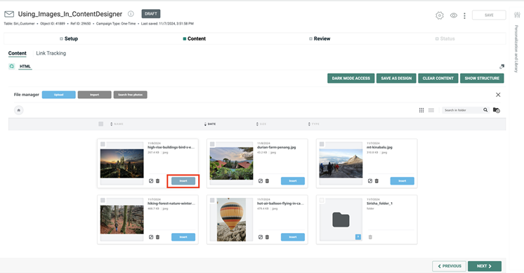
Click Browse. The Hosted image library screen is displayed.
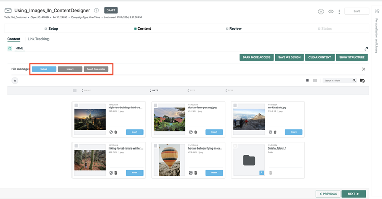
-
Click Insert to select an image to use in your content. You can also use the Search capability to search for the images in the Hosted image library to use in your content.
-
You can also click Upload to upload images to Cheetah Digital Hosted Image Library from the Content Designer, or delete the images in the library by clicking the
 icon corresponding to the image.
Note: For alternate details on uploading images into your account, see Upload Hosted Items.
-
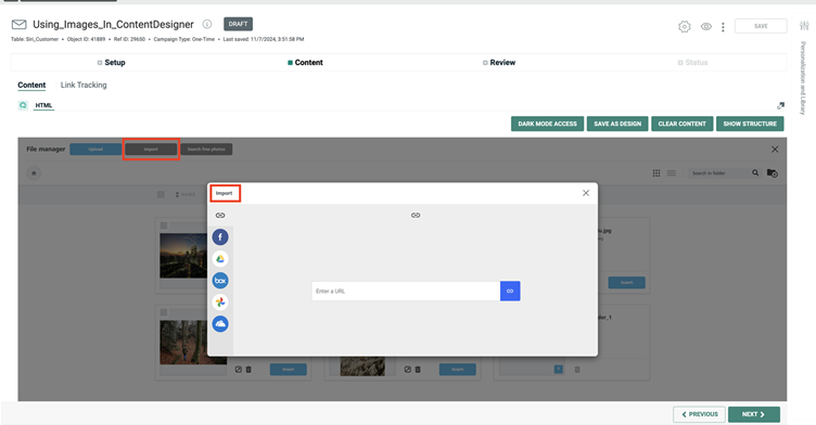
Alternatively, you can use the following options to select your images.
-
Import allows you to connect your existing image libraries like Google Photos, Google Drive and so on and import photos to use in your content.
-
Search Free Photos enables you to search, download and quickly integrate free stock professional-quality images from the Cheetah Digital's free image library to use in your content.
Click Search Free Photos and in the displayed Stock Image window, search for the required image from the library.
From the displayed results, select the image and click Import to download it to Cheetah Digital by Zeta Hosted Image Library.
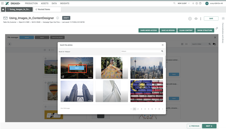
When the stock image is downloaded to the hosted image library, click Insert to use it in the content.
These images can also be accessed from the Hosted Items screen.
-
-
When finished, click Content tab in the right pane to return to the menu of element types.
Add a button
To add a button to your Design:
-
Drag-and-drop the Button item into the desired location in the workspace. The system adds a new button with the default label: "Button."
-
Click the new button to select it. The system displays a text editor tool bar with common text-formatting options, such as font, size, and typeface. Enter the button label.
-
While the button is selected, additional content properties for the button are displayed in the right-hand pane, allowing you to adjust the following:
-
Click action
-
Width (or "auto-width")
-
Background color
-
Text color
-
Alignment
-
Line height
-
Letter spacing -- Define the spacing in pixels between letters, including negative values.
-
Border radius
-
Content Padding -- Padding settings can be configured for all sides of the selected element. If you need to configure the sides separately, click the "More Options" toggle.
-
Border color and width -- Border settings can be configured for all sides of the selected element. If you need to configure the sides separately, click the "More Options" toggle
-
Block Padding -- Padding settings can be configured for all sides of the selected element. If you need to configure the sides separately, click the "More Options" toggle.
-
Hide item -- Optionally, you can configure this item to be hidden when the recipient views the message on a desktop, or on a mobile device.
-
- When finished, click the down-arrow icon within the Content tab again to return to the menu of element types.
Add a table
To add a table to your Design:
-
Drag-and-drop the Table item into the desired location in the workspace. The system adds a new table to the workspace.
-
Click the new table to select it.
-
While the table is selected, additional content properties for the table are displayed in the right-hand pane, allowing you to define the following:
-
Header: The Table content block includes the option to add headers to the first row of the table.
-
Structure: The following options are available:
-
Columns: Add or remove columns to the right of your table. The maximum number of columns you can add is eight.
-
Rows: Add or remove rows to the bottom of the table. There is no maximum number of rows you can add.
-
Background color: Edit the table’s background color.
-
Border: Customize your border style. You have the option to choose from solid, dotted, and dashed. You can also select a custom border color and size. For dotted and dashed border styles, use a border thickness of five or less for best results.
-
Striped Rows: You can use the Striped Rows content property to create rows with alternating colors. Toggle Striped Rows to ON and then select the background color you want to apply for the alternating rows. The initial table background color you select will be the other alternating color in your table.
-
Content: The following options can be customized in the content:
-
Font Family
-
Font Weight
-
Font Size
-
Text Color
-
Link Color
-
Align
-
Line Weight
-
Letter Spacing
-
Text direction
-
When finished, click the down-arrow icon within the Content tab again to return to the menu of element types .
-
Add a divider
Dividers are horizontal lines used to help create visual separation between design elements. To add a divider to your Design:
-
Drag-and-drop the Divider item into the desired location in the Workspace. The system adds a new divider line.
-
Click the new divider to select it.
-
While the divider is selected, additional content properties for the divider are displayed in the right-hand pane, allowing you to adjust the following:
-
Transparency
-
Line width and color
-
Alignment
-
Padding -- Padding settings can be configured for all sides of the selected element. If you need to configure the sides separately, click the More Options toggle.
-
Hide item -- Optionally, you can configure this item to be hidden when the recipient views the message on a desktop, or on a mobile device.
-
-
When finished, click the down-arrow icon within the Content tab again to return to the menu of element types.
Add a spacer
Spacers, as the name implies, simply adds space to your design. With this, you can more easily streamline the process of adding space to your design. To add a spacer to your Design:
-
Drag-and-drop the Spacer item into the desired location in the Workspace. The system adds a new spacer block.
-
Click the new spacer to select it.
-
While the spacer is selected, additional content properties for the spacer are displayed in the right-hand pane, allowing you to adjust the following:
-
Height
-
Hide on -- Optionally, you can configure this item to be hidden when the recipient views the message on a desktop, or on a mobile device.
-
-
When finished, click the down-arrow icon within the Content tab again to return to the menu of element types.
Add social media buttons
To add Social Media buttons to your Design:
-
Drag-and-drop the Social item into the desired location in the workspace. The system adds the default set of Social Media buttons (Facebook, Twitter, Instagram, and LinkedIn) to the Workspace.
-
Click the Social Media button to select it.
-
While the Social Media button is selected, additional content properties for the Social Media buttons are displayed in the right-hand pane, allowing you to adjust the following:
-
Icon set (square, round, monochrome, etc.)
-
Within the right-hand pane, adjust the sequence of the buttons by dragging a button and dropping it in its desired location.
-
Click Delete to remove a button.
-
Click Add New Icon to add buttons for other social media products and platforms.
-
Click More options then adjust the button's name, alternate text, and destination URL.
-
Padding -- Padding settings can be configured for all sides of the selected element. If you need to configure the sides separately, click the More Options toggle.
-
Hide item -- Optionally, you can configure this item to be hidden when the recipient views the message on a desktop, or on a mobile device.
-
-
When finished, click the down-arrow icon within the Content tab again to return to the menu of element types.
-
Icon set (square, round, monochrome, etc.)
-
Within the right-hand pane, adjust the sequence of the buttons by dragging a button and dropping it in its desired location.
-
Click Delete to remove a button.
-
Click Add New Icon to add buttons for other social media products and platforms.
-
Click More options then adjust the button's name, alternate text, and destination URL.
-
Padding -- Padding settings can be configured for all sides of the selected element. If you need to configure the sides separately, click the More Options toggle.
-
Hide item -- Optionally, you can configure this item to be hidden when the recipient views the message on a desktop, or on a mobile device.
-
-
When finished, click the down-arrow icon within the Content tab again to return to the menu of element types.
Add a personalization field
Personalization fields are used to populate a portion of your message with content pulled from your marketing database. For example, instead of "Dear Customer" as a greeting, you could replace the word "Customer" with the customer's actual first name.
Note: You can also add personalization fields within text; see Add a Text Block or Add a Title above more details on this method.
To add a personalization field to your Design:
-
Drag-and-drop the Library item into the desired location in the Workspace. The system adds an icon representing the position of the personalization field.
-
Within the Workspace, click the new personalization icon. The Merge Symbols for any previously-defined personalization fields in this Design are displayed within the right-hand pane. Optionally, select one of these fields.
-
If you need to define a new personalization field, within the right-hand pane, click add personalization and library tag. The Content pop-up window is displayed.
-
Within the Browse Fields list, navigate to and select the desired personalization field. You can also search for a field using the Search field in the top-right corner of the pop-up window.
-
Optionally, enter a default value for this personalization field in the Default text box. The default value is used if a record doesn't have a valid value in the field being used to personalize the message.
-
Optionally select a formatting mask from the Formatter drop-down menu. The formatting mask is used to control the appearance of the text in the personalization field. For example, you can format date fields as "mm/dd/yyyy." The system includes formatting masks for dollar amounts, dates, numbers, and URLs. You can also use a formatting mask to truncate or encode the personalization field.
-
Click Save. The system displays the Merge Symbol beneath the personalization icon.
A Merge Symbol is a textual representation of the personalization field, consisting of the field name enclosed in double-brackets. For example: {(first_name)}. If you defined a default value above in step 5, this value is also displayed within the Merge Symbol. For example: {(first_name|Customer)}. If you selected a formatting mask above in step 6, the formatting mask is displayed within the Merge Symbol using a special code. For example, the "mm/dd/yy" date field format mask is represented by the code: "d:d." Therefore, the Merge Symbol for this field would be: "{(date_field||d:d)}."
-
Optionally, you can configure this item to be hidden when the recipient views the message on a desktop, or on a mobile device.
-
When finished, click the down-arrow icon within the Content tab again to return to the menu of element types.
Add other Cheetah Digital by Zeta assets
The Content Designer allows you to insert other Cheetah Digital by Zeta assets (such as Content Blocks, Opt-Out Messages, etc.) into the Design.
Note: You can also add Cheetah Digital by Zeta assets within text; see Add a Text Block or Add a Title above more details on this method.
To add a Cheetah Digital by Zeta asset to your Design:
-
Drag-and-drop the Library item into the desired location in the Workspace. The system adds an icon representing the position of the asset.
-
Within the Workspace, click the new asset icon. The Merge Symbols for any previously-defined assets in this Design are displayed within the right-hand pane. Optionally, select one of these assets.
-
If you need to define a new asset, within the right-hand pane, click add personalization and library tag. The Content pop-up window is displayed.
-
Click the Library tab.
-
From the Object Type drop-down menu, select the asset type.
-
Browse to and select the desired asset. You can also search for an asset using the Search field.
-
Click Save. The system displays the Merge Symbol beneath the asset icon.
A Merge Symbol is a textual representation of the asset, consisting of the asset's name and Object Reference ID enclosed in double-brackets. For example: {[Logo_Header|8687]}.
-
Optionally, you can configure this item to be hidden when the recipient views the message on a desktop, or on a mobile device.
-
When finished, click the down-arrow icon within the Content tab again to return to the menu of element types.
Add custom HTML
To add custom HTML code to your Design:
-
Drag-and-drop the HTML item into the desired location in the Workspace. The system adds a new line of HTML code consisting of the text string: "I'm a new HTML block."
-
Click the new HTML block to select it.
-
While the HTML block is selected, additional content properties are displayed in the right-hand pane:
-
In the code editor, enter your custom HTML code.
-
Hide item -- Optionally, you can configure this item to be hidden when the recipient views the message on a desktop, or on a mobile device.
-
-
When finished, click the down-arrow icon within the Content tab again to return to the menu of element types.
Add a video
To add a link to a video within your Design:
-
Drag-and-drop the Video item into the desired location in the Workspace.
-
Click Add a video url.
-
Additional content properties for the video are displayed in the right-hand pane, allowing you to configure the following:
-
Enter the Video URL.
-
Padding -- Padding settings can be configured for all sides of the selected element. If you need to configure the sides separately, click the More Options toggle.
-
Hide item -- Optionally, you can configure this item to be hidden when the recipient views the message on a desktop, or on a mobile device.
-
-
When finished, click the down-arrow icon within the Content tab again to return to the menu of element types.
Add an icon
An Icon element consists of a small image and optionally a corresponding text string. You can use Icons to create visual bullet lists, ratings, properties, logo galleries, etc. A group of related icons is referred to as an "icon collection." All of the icons in the collection can be configured with the same formatting parameters.
To add an icon within your Design:
-
Drag-and-drop the Icon item into the desired location in the Workspace.
-
Click Add new icon to define the first icon in the icon collection. The system adds a pre-defined icon image to the Workspace.
-
To select the icon image, click change image. The File Manager pop-up window is displayed.
-
Navigate to the desired Hosted Item folder within your account.
-
Click the desired image, then click Insert. The icon image is displayed within the Workspace.
Note: For more details on uploading images into your account, see Upload Hosted Items.
-
Click the icon to select it.
-
To configure the icon properties, click the More options toggle. Enter the following properties:
-
Image URL: The filepath to the Hosted Item you selected above is displayed here.
-
Alternate Text: Enter the text that appears if a user hovers their mouse cursor over the icon image.
-
Icon Text: Enter the text associated with the icon.
-
Text Position: Select where you want the icon text to appear in relation to the icon image -- top, bottom, left, or right.
-
Link Type: To make the icon a clickable link, select a link type.
-
URL: To make the icon a clickable link, enter the destination URL. Or optionally, click "Link File" and browse to and select a file.
-
-
Optionally to remove the icon, click Delete.
-
Optionally, to apply image effects, click Apply effects & more. See below for more details on using the Image Editor.
-
Repeat the above steps as needed to define additional icons in this icon collection.
-
To rearrange the icon sequence within the collection, click-and-drag on the "handle" to the left of the icon thumbnail, and move the icon into the desired position in the collection.
-
While the icon collection is selected, additional content properties are displayed in the right-hand pane, allowing you to adjust the following options. These options are applied to all icons within the icon collection.
-
Alignment
-
Font family, size, and color
-
Icon size and spacing
-
Padding -- Padding settings can be configured for all sides of the selected element. If you need to configure the sides separately, click the More Options toggle.
-
Hide item -- Optionally, you can configure this item to be hidden when the recipient views the message on a desktop, or on a mobile device.
-
-
When finished, click the down-arrow icon within the Content tab again to return to the menu of element types.
Add a menu
A Menu element consists of a series of one or more text strings, optionally configurable as links. All of the items in the Menu can be configured with the same formatting parameters.
To add a Menu within your Design:
-
Drag-and-drop the Menu item into the desired location in the Workspace.
-
Click the Menu item in the Workspace to select it.
-
Click Add new item to define the first item in the Menu.
-
Enter the following properties:
-
Text: Enter the text for this Menu item.
-
Link Type: To make the text a clickable link, select a link type.
-
URL: To make the text a clickable link, enter the destination URL. Or optionally, click Link File and browse to and select a file.
-
-
Optionally to remove the item, click Delete.
-
Repeat the above steps as needed to define additional items to this Menu.
-
To rearrange the item sequence within the Menu, click-and-drag on the "handle" to the left of the item name, and move the item into the desired position in the Menu.
-
While the Menu is selected, additional content properties are displayed in the right-hand pane, allowing you to adjust the following options. These options are applied to all items within the Menu.
-
Font family, size, and color
-
Link color
-
Alignment
-
Layout (horizontal or vertical)
-
Separator
-
Mobile menu -- If enabled, the Menu will collapse on a mobile device, and be displayed as an expandable icon. Select the desired icon and color options.
-
Padding -- Padding settings can be configured for all sides of the selected element. If you need to configure the sides separately, click the More Options toggle.
-
Hide item -- Optionally, you can configure this item to be hidden when the recipient views the message on a desktop, or on a mobile device.
-
-
When finished, click the down-arrow icon within the Content tab again to return to the menu of element types .
Add a GIF
To add a GIF within your Design:
-
Drag-and-drop the GIF item into the desired location in the Workspace.
-
Click Search to search the Giphy library. Enter your search text, then click on the desired GIF.
-
Click the GIF item in the Workspace to select it.
-
While the GIF is selected, additional content properties for the GIF are displayed in the right-hand pane, allowing you to adjust the following:
-
GIF width (or "auto-width")
-
Alignment
-
Dynamic -- see below for more details on dynamic GIFs
-
Alternate text
-
Click action
-
Padding -- Padding settings can be configured for all sides of the selected element. If you need to configure the sides separately, click the More Options toggle.
-
Hide item -- Optionally, you can configure this item to be hidden when the recipient views the message on a desktop, or on a mobile device.
-
-
When finished, click the down-arrow icon within the Content tab again to return to the menu of element types.
Note: Animated GIFs are not supported in MS Outlook 2007, 2010 and 2013. Only the first frame will be displayed in these email clients, so ensure that the first frame is what you want the recipient to see.
Dynamic GIFs
When you insert a GIF into the Content Designer, you can flag that GIF as “dynamic.” Dynamic GIFs change depending on one or more values that are passed to the system that delivers them. The link to the GIF is no longer a static URL, but rather a URL that contains some variables, such as an email, a customer ID, a date, etc. The variables are entered as merge tags in the URL and are replaced with actual values (e.g. the ID of a customer, the email of the recipient, the name of the person, etc.) when the email message is deployed.
To set up a dynamic GIF:
-
Insert the GIF as described above.
-
Click on the GIF within the Workspace to select it.
-
In the content properties pane, click the dynamic image toggle button.
-
In the Dynamic URL filed, enter the URL along with the desired merge tags.
Add a sticker
To add a sticker within your Design:
-
Drag-and-drop the Stickers item into the desired location in the Workspace.
-
Click search to search the sticker library. Enter your search text, then click on the desired sticker.
-
Click the sticker item in the Workspace to select it.
-
While the sticker is selected, additional content properties for the sticker are displayed in the right-hand pane, allowing you to adjust the following:
-
Sticker width (or "auto-width")
-
Alignment
-
Dynamic -- see below for more details on dynamic stickers
-
Alternate text
-
Click action
-
Padding -- Padding settings can be configured for all sides of the selected element. If you need to configure the sides separately, click the More Options toggle.
-
Hide item -- Optionally, you can configure this item to be hidden when the recipient views the message on a desktop, or on a mobile device.
-
-
When finished, click the down-arrow icon within the Content tab again to return to the menu of element types.
Note: Animated stickers are not supported in MS Outlook 2007, 2010 and 2013. Only the first frame will be displayed in these email clients, so ensure that the first frame is what you want the recipient to see.
Dynamic stickers
When you insert a sticker into the Content Designer, you can flag that sticker as “dynamic.” Dynamic stickers change depending on one or more values that are passed to the system that delivers them. The link to the sticker is no longer a static URL, but rather a URL that contains some variables, such as an email, a customer ID, a date, etc. The variables are entered as merge tags in the URL and are replaced with actual values (e.g. the ID of a customer, the email of the recipient, the name of the person, etc.) when the email message is deployed.
To set up a dynamic sticker:
-
Insert the sticker as described above.
-
Click on the sticker within the Workspace to select it.
-
In the content properties pane, click the dynamic image toggle button.
-
In the Dynamic URL filed, enter the URL along with the desired merge tags.
Add LiveContent
LiveContent activates data into personalized content and makes emails more interactive, personalized, and timely. With LiveContent integrated into Cheetah Digital by Zeta, the real-time personalization powered by LiveContent integration is a seamless way to insert LiveContent elements in email campaigns. For more details visit liveclicker.com.
Note: To use this feature, you must have Content Desginer and LiveContent set up and enabled. Please speak to your Client Services Representative for more details.
In order to add LiveContent content in a Cheetah Digital by Zeta email campaign, you must first create the LiveContent content element in your LiveContent account.
Under the GDPR, LiveContent is a data processor. If applicable, please contact your Zeta Representative for the data processing documentation. When LiveContent content based on the location rule is used, the location of a recipient is derived from the email opener and user agent string.
To add a LiveContent to your Design:
-
Drag-and-drop the LiveContent item into the desired location in the workspace. The system adds a LiveContent content block.
-
Click Browse in the LiveContent content block, to retrieve the list of published LiveContent campaign.
-
From the displayed list, select the desired LiveContent campaign and then the element to use in the Cheetah Digital by Zeta email campaign.
-
Click Add Element to insert the element in the Design.
-
When finished, click the down-arrow icon within the Content tab again to return to the menu of element types.
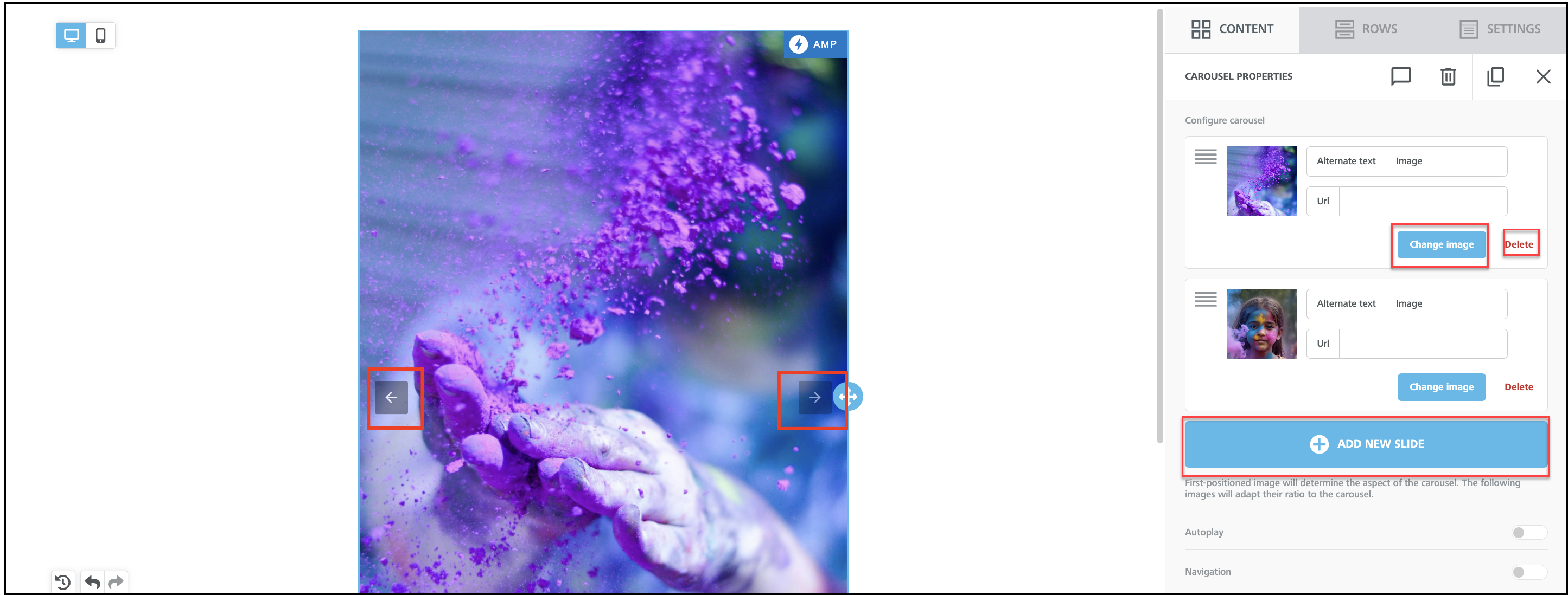
Add a carousel
Accelerated Mobile Pages (AMP) Carousel is a special component that allows you to showcase multiple images in an interactive, sliding format inside emails. Instead of a static image, users can swipe through multiple images inside the email itself, providing dynamic and personalized experience.
Note: AMP carousel works in email only if the email provider supports AMP content. Not all email clients can render AMP. Email providers that Support AMP for email, include:
Gmail (Web & Mobile Apps)
Yahoo Mail (Web)
Outlook.com (Web)
Mail.ru
To add a carousel to your design:
-
To use a carousel in Content Designer, first enable AMP for Email Campaigns in the AMP tab.
-
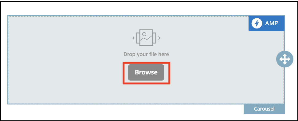
Drag-and-drop the Carousel item into the desired location in the Workspace.
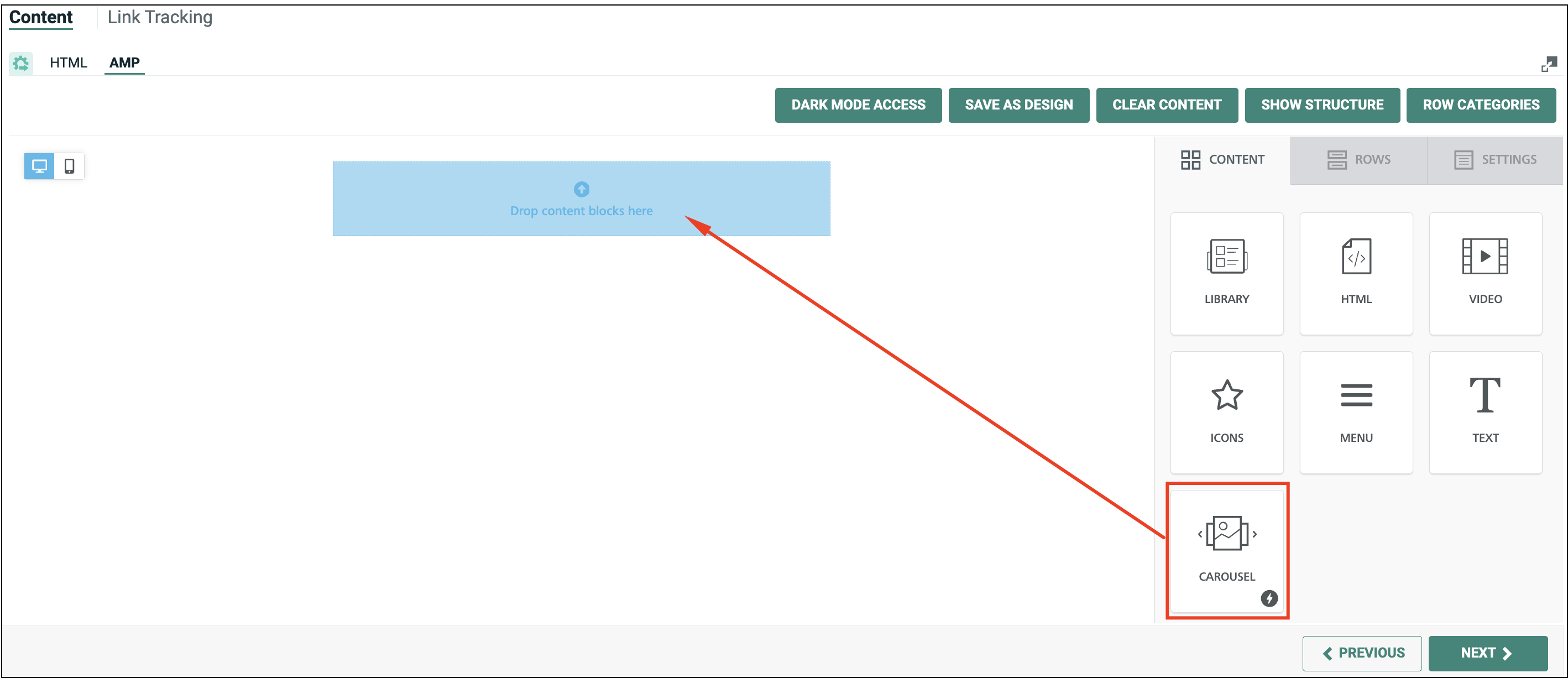
-
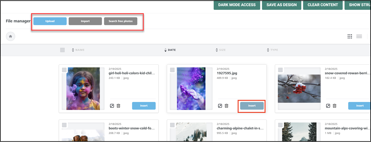
Click Browse. The Hosted image library screen is displayed.
-
Click Insert to add an image to use in your carousel. You can also use the Search capability to search for the images in the Hosted image library to use in your content.
-
Optionally, you can also click Upload to upload images to Cheetah Digital Hosted Image Library from the Content Designer, or delete the images in the library by clicking the
icon corresponding to the image.Note: For alternate details on uploading images into your account, see Upload Hosted Items.
Alternatively, you can use the following options to select your images.
Import allows you to connect your existing image libraries like Google Photos, Google Drive and so on and import photos to use in your content.
Search Free Photos enables you to search, download and quickly integrate free stock professional-quality images from the Cheetah Digital's free image library to use in your content.
-
You can now add more images to your carousel, or review and delete an existing image, using the Add New Slide, Change image and Delete options.
Note: For uploading images into your account, see Upload Hosted Items.
-
Optionally, you can use the following options to review your carousel.
-
When more images are added, you can click the Left and Right arrows to review the images.
-
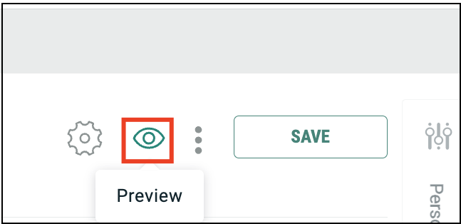
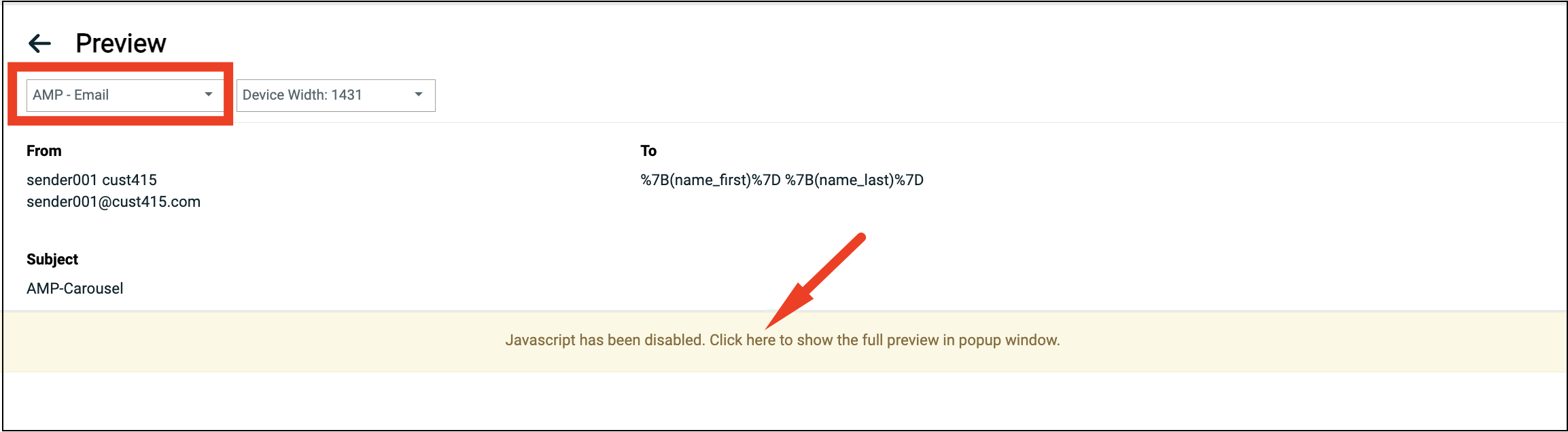
You can use the preview feature to preview the content in the carousel.
Note: Please ensure AMP - Email is selected from the menu below.
A Warning message will be displayed "Javascript has been disabled. Click here to show the full preview in popup window".
Click on the warning message to preview the carousel design in a popup window.
-
-
When finished, click Content tab in the right pane to return to the element menu.
-
-
By default, the Workspace shows the Desktop version of the message content. Optionally, click the Mobile toggle in the top-left corner of the Workspace to see the Mobile version of the message content. The Mobile version automatically applies content item settings, such as Hide Item. To switch back to the Desktop view, click the Desktop toggle.
-
If you need to roll back a change to the Design:
To undo the last change, click the Undo button in the lower-left corner of the Workspace.
To revert back to an earlier version, click the History button in the lower-left corner of the Workspace. The pop-up menu displays a timeline of changes including a description of the change, and a date / time stamp. Select the desired version.
-
In the Tool Bar, click Save.
Use AI content assistant
The Zeta AI Content Assistant provides efficient copywriting using AI for marketer efficiency.
Note: Ask your Zeta representative for the Zeta AI Content Assistant. You will receive the Generative AI Addendum. This must be e-signed or signed, scanned and returned to your Zeta representative. After Zeta receives your signed Generative AI Addendum, the capability will be provisioned to your account.
To use AI Content Assistant in your Design:
-
Drag-and-drop a Paragraph block onto the canvas into the desired location in the workspace. The feature is only available from Title, Paragraph, List blocks and Buttons. It is not available in the legacy Text block.
-
Click into the new Paragraph block and then click on the blue button that says: Write with AI.
-
You need to write a good quality prompt to specifically tell the AI what to do.
Note: Your AI Prompt for Marketing Copy should always include: Desired Voice + # of Words + Target Audience + Desired Outcome
The voice: With an active, persuasive marketer voice (you can also say compelling, same idea).
If you havebrand guidelines on voice, note them here. You can also say, in the marketing voice of mycompany.com (your company website URL or other example), write…
Directly state how many words: in 60 words
Who is the target audience: Describe who the customer for this product is, as well as you can. Is this going to a particular segment? If yes, describe it. Otherwise, just say “customer.”
What is the desired outcome: What do we want the customer to know about and what do we want them to do?
-
Click on the blue Generate button.
-
If you are happy with the result, click on the blue Apply button.
-
If you want the AI to rewrite the content, click into the box with the prompt “What would you like to write about?”
-
A selection of presets will appear. You can choose one, or type something original in.
-
Click on the blue Generate button. Then click on the blue Apply button.
For more detailed information and power-tip for marketer efficiency, refer Using the Zeta AI Content Assistant with Best Practices for AI-Assisted Copywriting.
Clone a content item
To create a duplicate of a content item:
-
Click on the desired content item to select it.
-
Within the Workspace, click the clone button (or click the clone button within the content properties panel). The tool creates a duplicate of the content item.
Rearrange content item
To move a content item within the Workspace:
-
Click on the desired content item to select it.
-
Click and hold on the handle icon to the right of the selected content item.
-
Drag the content item to its new location, and drop it.
Delete a content item
To delete a content item from the Design:
-
Click on the desired content item to select it.
-
Within the Workspace, click the delete button (or click the delete button within the content properties panel). The tool removes the selected content item.
Using the image editor
Click here
The Content Designer provides a built-in Image Editor for Image and Icon content items. The Image Editor allows you to apply a variety of different options and effects to an image, such as filters, stickers, and text.
To access the Image Editor:
-
Add an Image or Icon content item as described above, then click on it.
-
Select the image you want to use for the Image or Icon item.
-
Click apply effects & more. The Image Editor is displayed.
-
Select the desired editing tool from the Image Editor tool bar:
-
Filter: Select a pre-defined filter to change the look of the image.
-
Resize: Adjust the height / width of the image.
-
Crop: Select a portion of the image that you want to use.
-
Transform: Rotate or flip the image.
-
Draw: Draw on the image using a variety of brush colors, types, and sizes.
-
Text: Add a text box to the image.
-
Shapes: Add shapes to the image.
-
Stickers: Add stickers to the image.
-
Frame: Configure the borders of the image.
-
Corners: Round the image corners.
-
-
Using the selected tool, make any necessary changes or additions to the image.
-
Click apply to see the changes and return to the main Image Editor tool bar. Or, to close the selected tool and return to the main Image Editor tool bar, click close.
-
Click Save to save your changes and close the Image Editor.
Add structural elements to a design
Click here
To add a structure-related item to your Design:
-
Click show structure to display dashed lines representing the rows and columns in your Design. This view can be helpful when adding content into the Design. To toggle off this view, click hide structure.
-
Click the Rows tab.
-
Drag-and-drop the desired row type from the right-hand panel into the Workspace. The Content Designer supports a variety of rows featuring one, two, three, or four columns.
-
Click the row to select it.
-
While the row is selected, additional properties for the row are displayed in the right-hand pane, allowing you to adjust the following:
-
Row background color
-
Content background color
-
Vertical Alignment (top, center or bottom alignment)
-
Mobile stacking
-
Reverse stack order on mobile (this setting is beneficial for layouts with alternating images and text; enabling this option will ensure that on a mobile devices, images are consistently on top of their accompanying copy)
-
Row background image
-
-
If the row has multiple columns, you can use the Customize Columns widget to adjust the column properties. This widget supports the following features:
-
Resize column widths by dragging the divider icon in between two columns to the left or right. The minimum column width is 2.
-
Add a column by clicking Add new. The platform adds the new column to the far right, with a default width of 2. The maximum number of columns is six.
-
-
If the row has multiple columns, you can define properties specific to a single column. Click the desired column within the Customize Columns widget, then configure the following properties:
-
Column background color
-
Padding -- Padding settings can be configured for all sides of the selected element. If you need to configure the sides separately, click the More Options toggle.
-
Border -- Border settings can be configured for all sides of the selected element. If you need to configure the sides separately, click the More Options toggle.
-
Delete the column by clicking Delete. When a column is deleted, the nearest column on the left is automatically widened to encompass the width of the deleted column. The delete action is not available if the row has only one column.
Note: You can set global properties, such as a background color, that get applied to every row and column. You can then optionally override the global setting at an individual row / column level. For more details on global properties, see Configure Design Properties below.
-
-
When finished, click the down-arrow icon within the Rows tab again to return to the menu of row options.
-
If you need to roll back a change to the Design:
-
To undo the last change, click the Undo button in the lower-left corner of the Workspace.
-
To revert back to an earlier version, click the History button in the lower-left corner of the Workspace. The pop-up menu displays a timeline of changes including a description of the change, and a date / time stamp. Select the desired version.
-
-
In the Tool Bar, click Save.
Clone a row
To create a duplicate of a row
-
Click on the desired row to select it.
-
Within the Workspace, click the clone button (or click the clone button within the content properties panel). The tool creates a duplicate of the row beneath the selected row.
Rearrange rows
To rearrange the sequence of rows within the Workspace:
-
Click on the desired row to select it.
-
Click and hold on the "handle" icon to the left of the selected row.
-
Drag the row to its new location, and drop it.
Delete a row
To delete a row from the Design:
-
Click on the desired row to select it.
-
Within the Workspace, click the delete button (or click the delete button within the content properties panel). The tool removes the selected row.
Save a row
To save a row as a reusable element for future use and for sharing with other marketers:
-
Click on the desired row to select it.
-
Within the Workspace, click the Save button.
-
In the displayed Save Row popup window, enter the following details.
-
Name: Name of the row
-
Category: The category of the row such as header, footer
-
Tags: Tag to assign the row
-
-
Click OK, to save the row.
The Name and Category can be edited when required.
To use the saved row in a design, from the Row tab select the Category and then the required saved row from the filtered list of rows. Drag and drop the row to the Content Designer.
Modify a row category
To rename a row category:
-
From within the Rows tab, click Row Category. All the saved Row categories are listed in a popup window.
-
Click on the category name from the list and rename as required.
-
Press Enter on Windows or Return on Mac to save the new category name.
Delete a row category
To delete a row category:
-
From within the Rows tab, click Row Category. All the saved Row categories are listed in a popup window.
-
Select the required category from the list and click
 to delete .
 -
In the displayed confirmation window, click Delete.
Configure design properties
Click here
Global properties are used to define various options and default settings that are applied to the entire Design. In many cases, the global-level option can optionally be overridden at the individual item level.
To configure global properties related to the entire Design:
-
Click the Settings tab.
-
Configure the desired options:
-
Content area width: Define the width of the area where content elements can be dropped. According to email marketing best practices, it should typically be set to 600px or less. Please note that this is the maximum width that will be used on larger devices. When the device’s screen is smaller, the message will adjust automatically to it.
-
Background color: Select the message background color. This setting is effective only for rows and columns where a color has not been specified; otherwise, the background color specified for that structure element will be used.
-
Content area background color: Select the background color for the content area. This setting is effective only for rows and columns where a color has not been specified; otherwise, the background color specified for that structure element will be used.
-
Default font: Select the default font that will be used when another font family has not been specified. This setting is effective only for text blocks and buttons where a font has not been specified; otherwise, the font specified for that item will be used.
-
Link color: Select the link color. This setting is effective only for links where a color has not been specified; otherwise, the color specified for that link will be used.
-
Email Details - Subject and Preheader (Optional Properties): Use the Zeta AI Assist to create the Subject Line and Preheader based on your content. Click the Zeta Assistive AI Magic wand icon and select one of the options to generate Subject line, Preheader or both. In the displayed Generate Email Details popup window, you can select the required tone of voice from the available list and click Apply All. The Subject Line and Preheader will be created based on your content and also applied to the campaign’s subject line and preheader on the campaign’s envelope.
-
-
In the Tool Bar, click Save.
Clear content from a design
Click here
The platform currently doesn't allow you to delete a Design, but you can clear all of the content from within a Design:
-
Click Clear content. A confirmation dialog box is displayed.
-
Click Clear content.
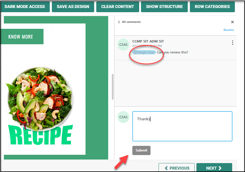
Comment and collaborate on design components
Click here
You can add a comment in any content block or row, so that the context of the discussion is always visible. Also tag other Cheetah Digital users in the comment, to ease collaboration, review and approval of your campaign design more quickly and efficiently.
To comment on a design:
-
On the Content Designer screen of your campaign, click the Content tab.
-
In the design workspace, select the content block you want to comment on.
Alternatively, you can select the Rows tab and select the row to comment on.
Note: Ensure your design is saved before adding the comment, as the comment might loose the context when the content block disappears if the design is closed without saving.
-
From the displayed options, click Show comments. This opens the comments panel in the right pane.
Note: The Commenting tool is hidden behind the text editor tool bar when you comment on a text component. Close the text editor tool bar to access the Show comments icon.
-
Type in your comments in the comments field. You can also tag your colleagues for their attention if needed.
-
Click Submit. This saves the comment in the design. If the comment is tagged, an email is sent to the person tagged with a quick link to the corresponding content block.
Collaborate with comments
The person tagged in the comment receives an email with a quick link to the content block commented on. Clicking this link directly opens the content block and the comment, if they are logged in to Cheetah Digital.
Alternatively, you can click on the Show comments icon on the design to open the Comments panel. The content blocks or rows with the comments are indicated by the comments icon as below.
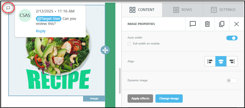
To continue collaboration on this comment, you can start a thread by adding a further comment, or close the comment by clicking on Resolve at the top right corner of the Comments panel.
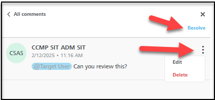
Edit or delete a comment
You can also edit a published comment or delete the comment which is no longer needed. The Edit and Delete options are available from the three dots menu at the right corner of the comment.
Quick view - dark mode access
Click here
Dark Mode is a device or application-specific setting that some recipients may prefer to use. It causes text and transparent image content to display with a light-color scheme on a dark-colored background. To view the design in dark mode:
-
Click Dark Mode Access. A Preview mode panel is displayed. This view will not display objects created outside of the Campaign.
-
Toggle Dark Mode Preview button to simulate the current design in dark mode.
-
Click X to close the Preview mode panel.
Switch to the advanced editor
Click here
The Content Designer allows you to toggle to the Advanced Editor, if you need to view or edit the message's underlying HTML code.
Note: If you toggle over to the Advanced Editor to view the message's source code, you can NOT toggle back to the Content Designer.
-
In the Tool Bar, click Actions > Advanced Edit.
-
A conformation dialog box is display, warning you that you won't be able to return to the Content Designer.
-
Click Save & confirm.
Working with format versions
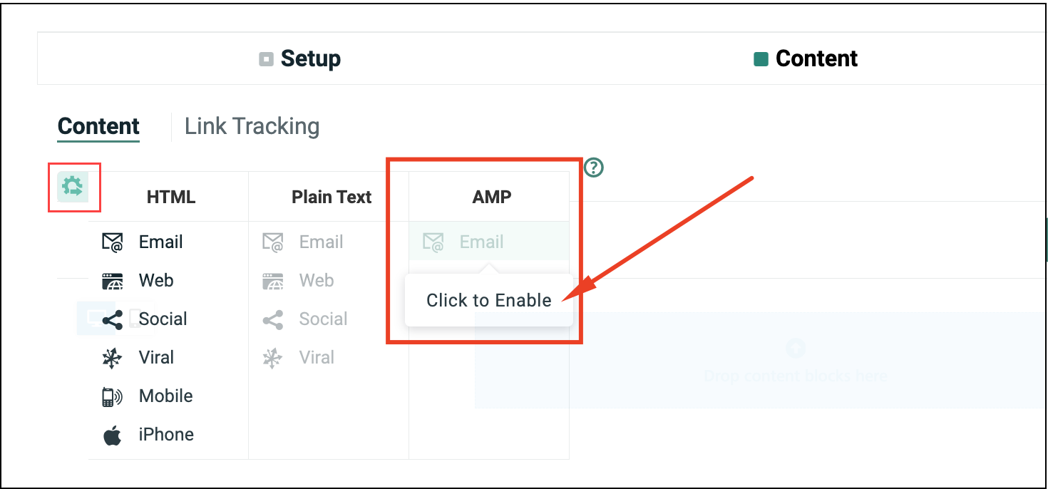
Cheetah Digital by Zeta allows you to define HTML and Plain Text format versions of your email message content in order to accommodate the different devices and applications used by consumers to view your message. If a consumer has an email application that's not configured to view HTML messages, he or she can still see the Plain Text version of your message. For more details, please see Format Versions. The features related to format versions are described below.
Create a new format version
Click here
Within the Content Designer, each version of your message is displayed as a separate tab. Simply select a tab to see the content for that version.
Most of the format versions in Cheetah Digital are actually groups containing multiple sub-options. For example, the "HTML" version contains options for:
-
Email Message: The standard email option, for viewing messages within an email client software application.
-
Web: The content to be displayed in a web browser if the user clicks a View as Web Page link.
-
Mobile Web: The content to be displayed in a mobile device web browser, for non-Apple devices, if the user clicks a View as Web Page link while reading the email on a mobile device.
-
iPhone: The content to be displayed in a mobile device web browser, for an Apple device, if the user clicks a View as Web Page link while reading the email on an Apple device.
-
Viral: If the original recipient forwards the email message to a friend (via a Share Message Web Form), this is the email message content to be displayed when the friend receives the message.
-
Share to Social: The content to be displayed if the recipient clicks a Share to Social link.
By default, all of these options are contained within the parent HTML version, meaning that the same HTML content will be used for all of those different contexts.
Optionally, you can pull one or more of those options out of the parent version, and create a new, separate format version. This process is referred to as "promoting" a format option into a new group. See "Promote a Format Option" below for more details.
By default, the platform will create an HTML version of your message content. You can (and typically should) also create a Plain Text version.
To create a new Plain Text format version:
-
Click the options button (gear icon). The system displays a menu showing the HTML version and all of its supported options ("Email," "Social," etc.), and the Plain Text version and all of its supported options.
-
Under the Plain Text version, enable at least one option by clicking on it. The system creates a new tab for the Plain Text version.
-
Click Generate Text from HTML to generate plain text content from the corresponding HTML option content.
-
Optionally, you can preview the different format versions to verify that the content is being displayed correctly for.
Note: While working on a Plain Text version, the Content Designer right-hand pane is not displayed, as this pane is relevant only to HTML versions. If you select a tab for an HTML format version, the Content Designer right-hand pane will again be displayed.
-
Delete a format version
Click here
To delete a format version of your message content:
-
Click the options button (gear icon). The system displays a menu showing the HTML version and all of its supported options ("Email," "Social," etc.), and the Plain Text version and all of its supported options. Any options you previously selected are highlighted.
-
Toggle off every option beneath the desired format version. The system removes the tab for that version from the Content Designer.
Promote / demote a format option
Click here
The HTML and Plain Text format versions in Cheetah Digital are actually groups containing multiple sub-options. For more details, please see Format Versions.
Optionally, you can pull one or more of those options out of the parent version, and create a new, separate format version. This process is referred to as "promoting" a format option into a new group.
For example, if you need the "Mobile" version of your HTML content to be different than the "Email" HTML content, you could promote "Mobile" to its own format version. Within the user interface, the system displays a new tab on the Content Designer with the label "HTML 2 - Mobile."
Note: The platform allows you to promote as many format versions, and create as many new groups, as you want. Continuing the above example, you could add the "iPhone" option into the "HTML 2 - Mobile" group. Or you could further promote "iPhone" into its own version, and the system would create a new tab named "HTML 3 - iPhone."
Conversely, format options can be "demoted," which moves them back into their previous format version group.
To promote a format option into its own version:
-
Click the options button (gear icon). The system displays a menu showing the HTML version and all of its supported options ("Email," "Social," etc.), and the Plain Text version and all of its supported options.
-
Hover your mouse cursor over the desired format option. A green "handle" appears on the left-hand side of this format option.
-
Click the green handle, and drag it to the right. The system displays a new blank tab. If you want to move this option into another existing group, drop the option onto that group. Or, if you want to create a new group, drop the option onto the new blank tab.
To demote a format option:
-
Click the options button (gear icon). The system displays a menu showing the HTML version and all of its supported options ("Email," "Social," etc.), and the Plain Text version and all of its supported options.
-
If the desired format option is NOT the only option in its current group, you can drag-the-drop the format option from its current group into any other format version. If the desired format IS the only option in its present group, then you can't drag-and-drop it. Instead, click on the option to disable it; the system automatically moves it back into its default format version.
Disable / enable a format option
Click here
Cheetah Digital by Zeta allows you to define HTML and Plain Text format versions of your email message content in order to accommodate the different devices and applications used by consumers to view your message. If a consumer has an email application that's not configured to view HTML messages, he or she can still see the Plain Text version of your message. For more details, please see Format Versions.
The format versions in Cheetah Digital are actually groups containing multiple sub-options. Optionally, you can disable these options so that they're not used within your Campaign.
To disable a format option:
-
Click the options button (gear icon). The system displays a menu showing the HTML version and all of its supported options ("Email," "Social," etc.), and the Plain Text version and all of its supported options. Any options you previously selected are highlighted.
-
Click on the desired option to toggle it off.
To enable a previously disabled format option:
-
Click the options button (gear icon). The system displays a menu showing the HTML version and all of its supported options ("Email," "Social," etc.), and the Plain Text version and all of its supported options. Any options you previously disabled are low-lighted.
-
Click on the desired option to toggle it on.
Note: Optionally, you can pull one or more of these options out of the parent version, and create a new, separate format version. This process is referred to as "promoting" a format option into a new group. See "Promote / Demote a Format Option" above for more details.