
Content Blocks support the use of SG tags. SG tags are Selligent-specific HTML tags that let you configure layout and content through a properties panel and make content language-dependent.
When you add SG tags to a Content Block and then use that Content Block in a message:
- You can configure the SG tags directly in the message, when the attributes for the SG tag are omitted or left empty. For example, when adding the sg:img tag without attributes in the Content Block, all attributes can be defined in the message itself.
- The same Content Block can be reused multiple times, with different values set for each SG tag.
- Each instance of the Content Block can display different content.
This approach is commonly used to create multilingual or configurable content.
Important note: When using SG tags in a Content Block, you need to define either all attributes in the Content Block or omit them all. This implies that the SG tag is either fully defined in the Content Block or, when attributes are omitted, fully defined in the message.
Supported SG-Tags in Content Blocks
You can add the following SG tags to a Content Block:
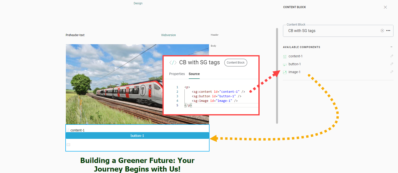
<sg:content id="" />
<sg:button id="" />
<sg:image id="" />
<sg:text id="" />
<sg:barcode id="" />
<sg:video id="" />
<sg:conditional id="">
<sg:head id="">
<sg:lang id="">
<sg:option id="">
<sg:spacer id="">
<sg:var id="">
How SG tags appear in messages
When a Content Block containing SG tags is used in a message:
- All SG tags appear in the properties panel.
- A preview of each SG tag is shown.
- If the SG tag already contains content, that content appears in the preview.
- If no content is defined, an icon with the SG component name is displayed.
This allows you to configure each SG tag without editing the Content Block itself.
Use the SG:head tag
In addition to the tags listed above, you can add the following tag:
<sg:head id="" />An <sg:head> tag places its content in the <head> section of the message where the Content Block is used. This tag is typically used to define:
- <style> elements
- <script> elements
The <sg:head> tag behaves differently from other SG tags:
- All <sg:head> tags are rendered at the bottom of the <head> section.
- If multiple <sg:head> tags exist across one or more Content Blocks, they are rendered sequentially.
- The order of the Content Blocks in the message determines the rendering order.
Example of <sg:head> usage:
Consider a message that includes three Content Blocks:).
- CB_style_h1_and_h2_tags, contains an sg:head tag with styling for h1 and h2 headers.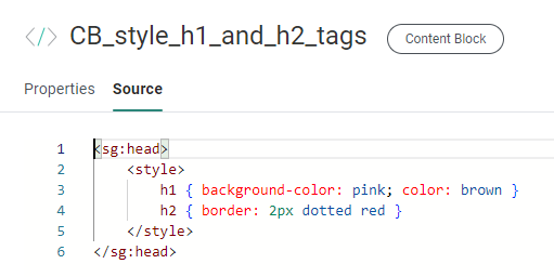
- CB_div_with_styling_applied, contains a div with id="heading" and h1 and h2 elements as child elements, and specific styling for these h1 and h2 tags in the heading id parent tag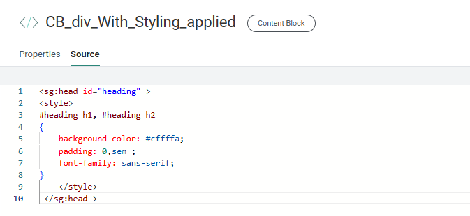
- CB_background_CSS, contains an sg:head tag with styling for the background of the entire message.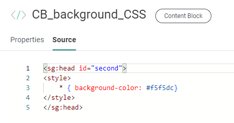
The message also includes a Text component with content styled as:
- an h1 heading
- an h2 heading
- paragraph text
In the message (in the Content chapter of Selligent), the three Content Blocks are added.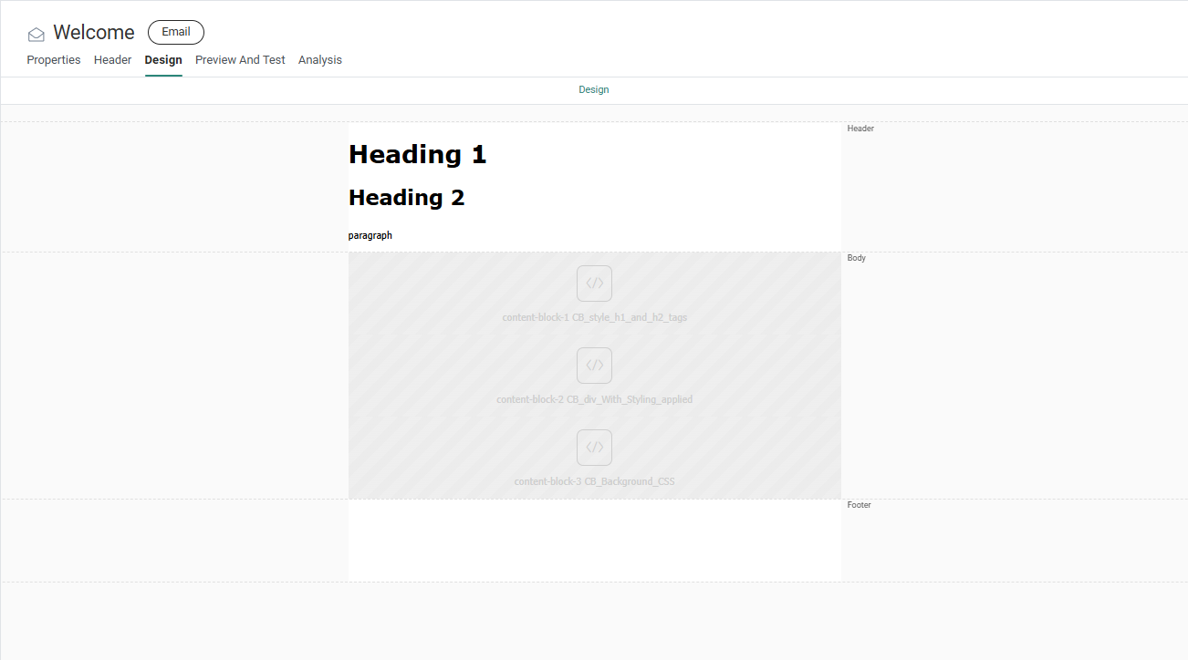
When previewing the message, the applied sg:head stylings become visible :
- The pink background-color for h1, and the dotted red border for h2 are visible for all h1 and h2 headers, outside and within the div with id="heading" (sg:head styling coming from the first Content Block CB_style_h1_and_h2_tags).
- The h1 and h2 headers within the div with id="heading" have additional styling applied, such as the font-style, text-shadow and padding (sg:head styling coming from the second Content Block CB_div_with_styling_applied).
- The entire message has a beige background color (sg:head styling coming from the third Content Block CB_background_CSS).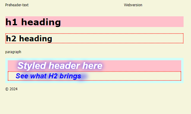
Set attributes on SG tags
For certain SG tags, you can define style and behavior using attributes.
The following attributes are supported for the following SG tags:
-
sg:image
- id: cannot be empty or contain spaces
- src: Image source
- href: Image link
- alt: Alternative text
- style: Style options such as width
-
sg:button
- id: cannot be empty or contain spaces
- href: Button link
- text: Button text
- style: Style options such as width
-
sg:content
- id: cannot be empty or contain spaces
- style: Style options such as width
-
sg:video
- id: cannot be empty or contain spaces
- poster: Image shown while the video loads or before playback
- src: Video source
- href: Video link
- img: Fallback image
- style: Style options such as width
-
sg:spacer
- id: cannot be empty or contain spaces
- style: Style options such as width
-
sg:barcode
- id: cannot be empty or contain spaces
- barcodetype: Barcode type (Ean-13, Code39, Code128, or QR)
- value: Encoded value
- Can include personalization, for example: https://discount.shop/basket.asp?visitor=[% MASTER.ID %]
- alt: Text shown if the barcode cannot be displayed
- orientation: Barcode orientation (Normal, Turn 90 Left, Turn 90 Right, Turn 180)
- fontsize: Font size in pixels
- width: Barcode width in pixels
- height: Barcode height in pixels
- borderwidth: Border width in pixels
- version: QR code version (1–40)
- errorcorrectionlevel: QR code error correction level
- style: Alignment (Left, Right, Center)
Note: When you set an attribute directly on an SG component in a Content Block, that attribute becomes read-only when the Content Block is used in a message. Also, either all attributes are set in the SG component or none.
Changes made to style options in a Content Block automatically apply to all messages that use that Content Block.
More information on the use of Content Blocks with SG-tags can be found in this topic.