
Overview
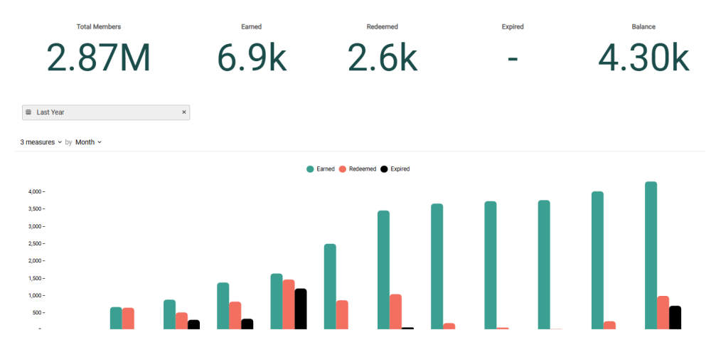
The Program Economy Dashboard shows Key Performance Indicators (KPIs) related to your primary Metric, including Metrics earned, redeemed, and expired, and the resulting outstanding Metric balance for all of your loyalty program Members.
Access
To access the Program Economy Dashboard, select Analytics from the top navigation bar, then select Program Economy Dashboard from the side navigation menu.
Dashboard Details
The following KPIs are displayed as a series of Tiles across the top of the Program Economy Dashboard:
-
Total Members: The total number of Member Profiles in your loyalty program.
-
Earned: The sum of points earned by your loyalty program Members during the specified reporting period.
-
Redeemed: The sum of points redeemed by your loyalty program Members during the specified reporting period.
-
Expired: The sum of points expired during the specified reporting period.
-
Balance: The current point balance of all Member Profiles in your loyalty program (Earned minus Redeemed minus Expired).
Beneath the KPI Tiles, the Program Economy Dashboard displays a bar chart. This chart displays the trends of earned, redeemed, and expired point totals over the selected reporting period, as well as the cumulative point balance over the same period. If you hover your mouse over a bar in the chart, the platform displays a pop-up with the exact count for that time period.
Filter the Dashboard
The Program Economy Dashboard provides a date range filter used to define the Dashboard’s reporting period. Optionally configure the following filter:
-
Date Range: Select Last Week, Last Month, Last Quarter, Last Year, or enter a custom date range by defining the start date and end date. The default filter selection is Last Year.
Configure the Bar Chart
Beneath the KPI Tiles, the Offer Performance Dashboard displays a bar chart that visually charts how Members are using their points over time.
You can adjust the metrics that are included on the chart, and change the time period used to group data on the chart. Please note that the date range filter selected above is also applied to the chart.
-
Measures: By default, the chart shows the counts of issued, redeemed, and expired Offers. Optionally, you can also show cumulative point balance. Using the Measures menu above the chart, you can toggle each of these Measures on or off.
-
Group by: By default, the chart displays counts By Month, with each point on a line representing a month. To change how data is grouped, select a different reporting frequency from the drop-down menu above the chart: By Month or By Week.